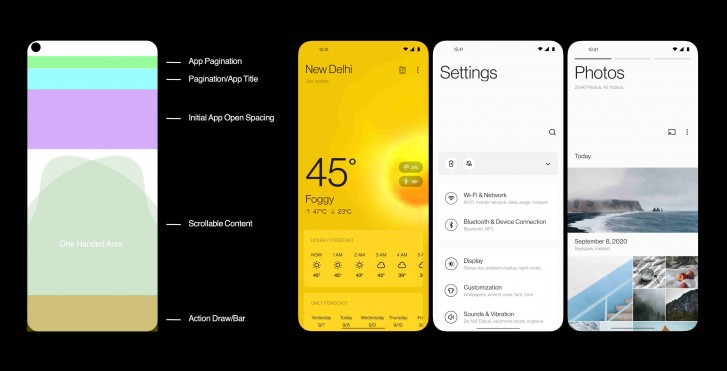
As phones continued to grow larger in size, some manufacturers are paying more and more attention to the ergonomics of their software overlays. With OxygenOS 11, OnePlus is going for a big redesign of its software with an emphasis on one-handed usе. The OxygenOS 11 beta is already available for OnePlus 7 and 8 series phones alongside the Android 11 Developer Preview and now the company revealed how it’s new OxygenOS visual identity came to be.

At its core, OxygenOS tries to offer a stock Android feel with the right touch of extra features on top for better user experience. One key improvement is the focus on one-handed usability. OnePlus conducted testing with its users to help determine the ideal in-app text size.
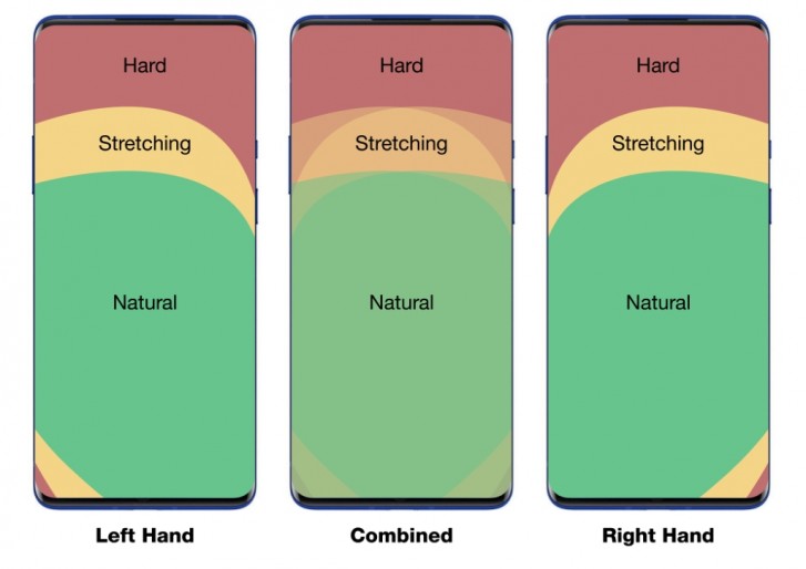
Users also compiled a heat map of display touch areas ranging from easy to

There’s also app-specific additions like the new Quick Share button in the camera app which allows you to press and hold on the thumbnail of your last stored image for quick sharing options. OxygenOS 11 also brings the new OnePlus Sans font, optimized dark mode and many more visual overhauls.

0 Response to "OnePlus details OxygenOS 11 design"
Post a Comment