Introduction
At the beginning of this year, Oppo released the F15 but without a Pro version. The phone went by largely unnoticed.
Today, skipping straight to 17, the new F17 series comes in two versions - Pro and non-Pro. We got the F17 Pro for this hands-on review and let us tell you more about it.
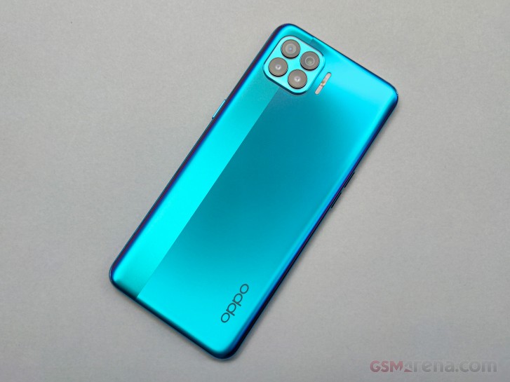
The F17 Pro offers a strange combination of a chipset belonging to the lower-end spectrum of the mid-range segment, the Helio P95, while also boasting a Super AMOLED screen with dual-punch hole design. Other standout features include 30W VOOC 4.0 fast charging, an unusual quad-camera setup and extremely thin chassis.
Oppo F17 Pro specs
- Body: 160.1 x 73.8 x 7.48 mm, 164g; Front glass, plastic body
- Screen: 6.43" Super AMOLED, FHD+ (1080 x 2400px) resolution
- Camera: Primary: 48MP Quad-Bayer, f/1.8 aperture, 0.8µm pixel size, 1/1.2" sensor size; Ultra-wide: 8MP, f/2.2 aperture, 1/4" sensor size; Depth sensors: 2x 2MP mono sensor, f/2.4 aperture
- Front camera: Main: 16MP f/2.4 aperture; Depth sensor: 2MP f/2.4
- Chipset: Mediatek Helio P95 (12nm): Octa-core (2x2.2 GHz Cortex-A75 & 6x 2.0 GHz Cortex-A55), PowerVR GM9446 GPU
- Memory: 8GB/128GB, expandable via microSD card
- OS: Android 10, Realme UI
- Battery: 4,000 mAh, 30W VOOC 4.0 fast charging
- Misc:Under-display fingerprint reader
Aside from the hardware upgrades over the Oppo F15, the F17 Pro also delivers on the software front. The latest ColorOS 7.2 has a couple of neat tricks up its sleeve like intelligent overnight charging, air gestures support and some additional camera features that need exploring.
Unboxing the Oppo F17 Pro
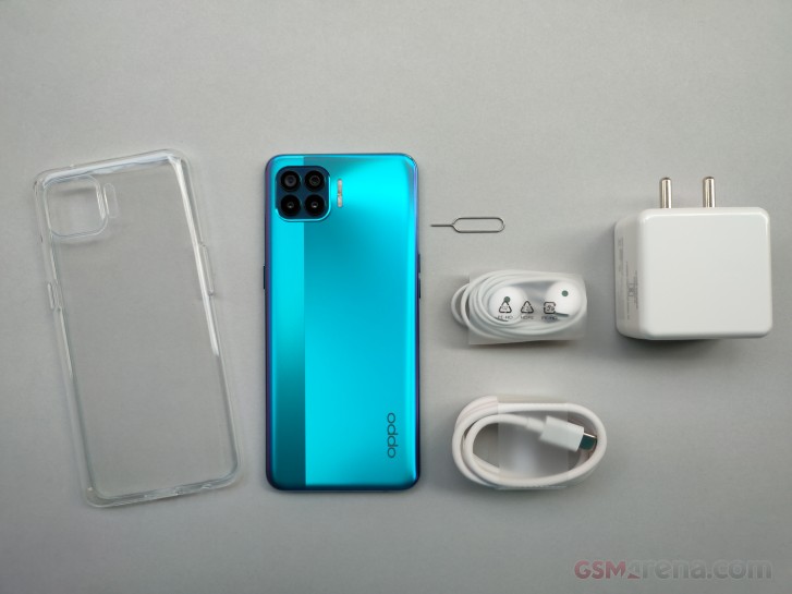
The standard box contains not only the appropriate 30W VOOC 4.0 charger but also a pair of headphones with 3.5mm cable and a transparent silicone case.
Design and ergonomics
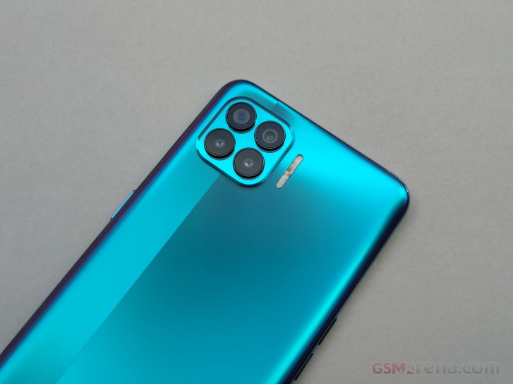
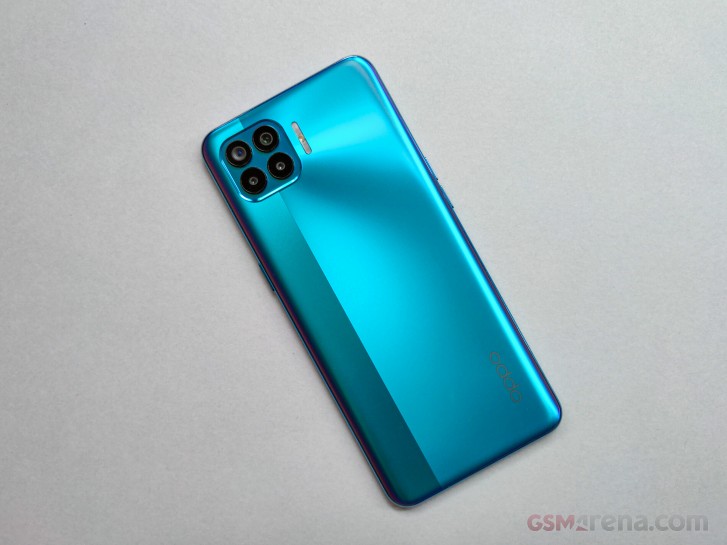
Undoubtedly, the design of the F17 Pro is one of the standout features. Although with plastic back, the handset feels sleek. Real sleek. Even sleeker than Reno4 Pro with a small strip coming down from the camera module that feels glossier. The best part is that the finish provides better grip and didn't pick up nearly enough fingerprints to call it a "fingerprint magnet". There's a reason Oppo says it's a "fingerprint-proof finish".
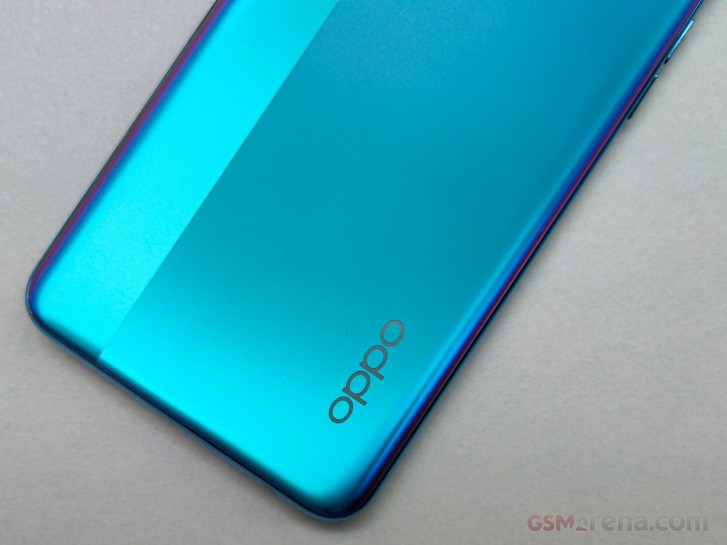
Additionally, there are subtle purple-ish accents around the sides of our Magic Blue color and they look amazing. The blue color itself also comes in different shades depending on the lighting. The frame that puts this all together strongly resembles the one on the Reno4 Pro.
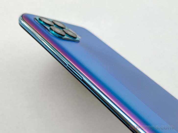
Speaking of the Reno4 Pro, the finish on the back feels smoother on the F17 Pro and it's a pleasure to hold and type on. It gives you a pleasant sense of secure and comfortable grip. It's strange to see a more premium appeal on a cheaper phone from Oppo. It's rather unusual for a slim phone like the F17 Pro. The thickness of the device is just 7.48mm and one would expect the side frame to dig deep into your palm. But this is not the case.
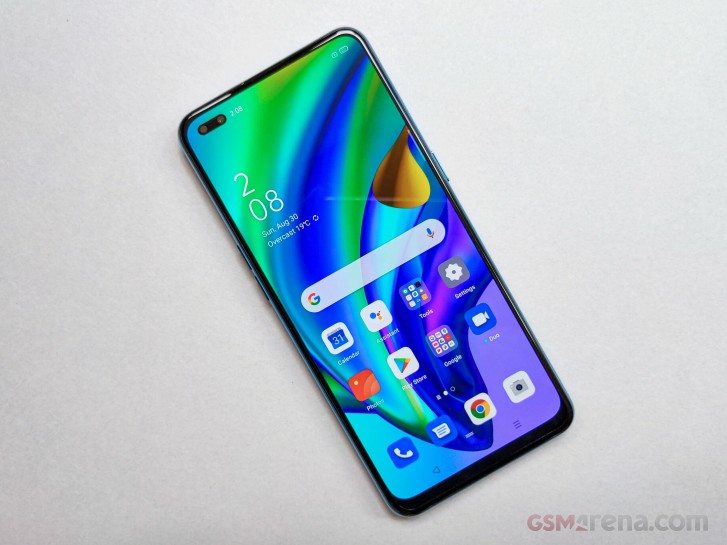
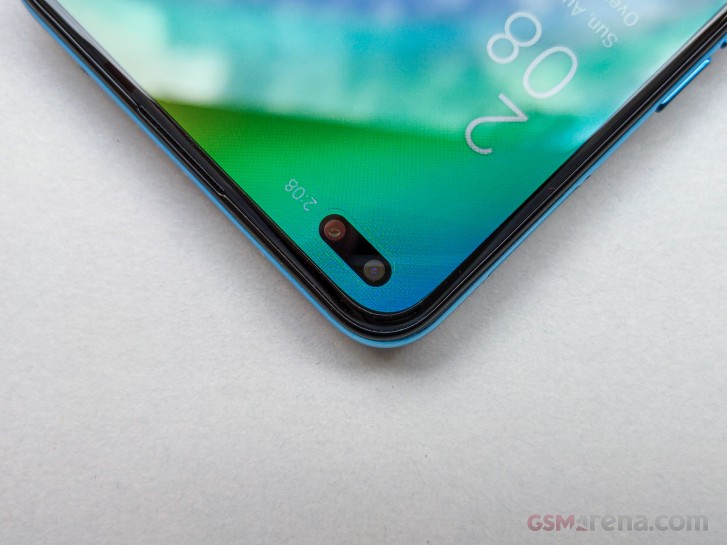
The front surprises with rather thin side bezels and more importantly, with impressively small cutout for the dual-front facing cameras. We can't cite any numbers but it definitely looks smaller than most of the punch-hole implementations we've seen. Oppo says the diameter of the hole is just 3.7mm.
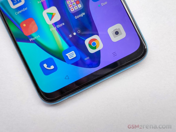
There's also a fingerprint reader placed under the screen, which works well judging by the short time we've used it. It's fairly accurate but drags behind in terms of speed compared to conventional capactivie ones. That's not always the case, especially with Oppo smartphones. So far, most of Oppo's smartphones have offered blazing-fast and reliable under-display fingerprints making us think that the slower chipset could be the reason why this one doesn't feel as snappy. Still, our only complaint would be the positioning. The sensor should have been placed a bit higher because the current implementation requires some finger gymnastics.
Hardware
With the design out of the way, now let's make a quick overview of the hardware. The first thing that stands out is the Super AMOLED display. A Full HD+ (1080 x 2400px) resolution fits in a 6.43-inch diagonal and accommodates a rather small dual-punch hole for the front-facing cameras. Nothing out of the ordinary, indeed, but when you add the advertised 800 nits of peak brightness and TÜV Rheinland's certification, the panel suddenly makes an impression. In a budget phone like this one, a proper OLED panel is always more than welcome. Sure, there's no 90Hz refresh rate, but we don't expect it to have anyway. You also get Widevine L1 certification with the display so you can enjoy Amazon Prime Video and Netflix content in Full HD.
Unlike its non-Pro counterpart, the F17 Pro offers just one memory configuration - 8GB of RAM with 128GB of expandable storage. A MediaTek P95 sits behind the wheel and we feel like this would be one of the few setbacks of the phone as a whole. The rather competent and nicely put together hardware will drag behind the Helio P95. We are not saying it's a bad SoC, it just feels like it doesn't fit into the picture. And it poses an incremental upgrade over its predecessor, the Helio P90 from 2019 anyway.
The biggest trade-off of owning a super slim smartphone is the battery. The Oppo F17 Pro features a 4,000 mAh battery, which still meets the market's standards in 2020 but it also feels a tad less than most of the competitors pushing the capacity beyond 4,500 and closer to 5,000 mAh. The good news is that there's a 30W VOOC 4.0 charging tech on board topping-up the battery from 0 to 100% in just 57 minutes. And considering the fact that no one charges their phone from completely flat, in just 20 minutes you should be able to squeeze out a day of charge.
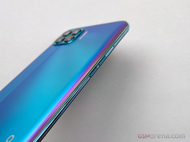
Finally, we have a total of six cameras to go through - two on the front and four on the back. The main one on the front is 16MP with f/2.4 aperture while the secondary 2MP unit is used for depth information. To our surprise, the back has two of those as well. The back camera module resembling the iPhone 11's consists of a 48MP main camera with f/1.8 aperture, 8MP ultra wide-angle camera with f/2.2 opening while the other two are 2MP sensors used for depth information only. Oppo says that the two working together along with the main camera allows them to do portraits containing more than one subject. It's called Dual Lens Bokeh.
So let's say you have two or more people in the frame in different planes. The software will extract information from the two depth sensors so it focuses on the two subjects and blur out the rest with the help of some AI-powered algorithm. Oppo doesn't give any specifics about how exactly that works but it definitely sounds like something we would like to try in the full review.
Software and features
On top of the usual ColorOS 7.2 features, there are a couple of new ones that debut with the F17 Pro pushing the phone's experience closer to the upper-mid-range class. These new features are not only for show off but have some practical implications as well.
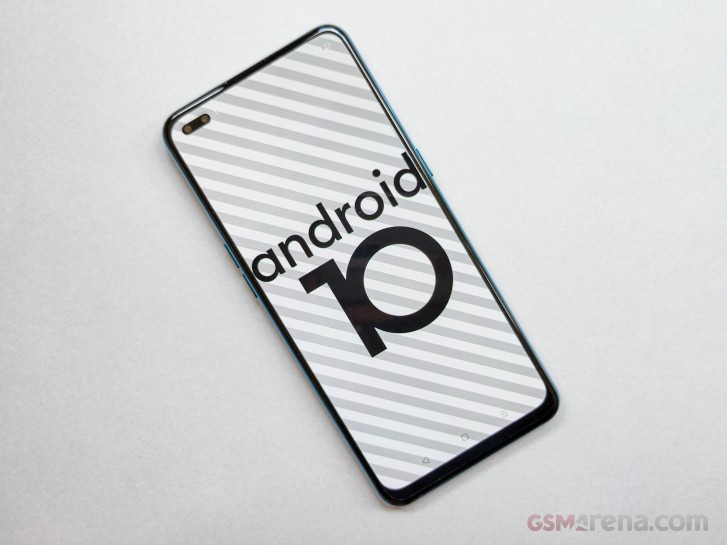
For example, there's an AI algorithm that tracks your sleeping and charging habits so it can take care of your battery. If you are a man of habit and like to charge your phone during the night, the software will take notice, cut off the charging at around 80% and top-off the battery right before you wake up. The goal is to keep the battery in healthier range while still giving you the full charge you want to start the day.
There's also a Super Saving Power Mode to take care of things in the other end of the spectrum. Oppo says that with even 5% remaining, the phone will be able to last 15 hours of standby or 70 minutes of phone calls, or 52 minutes in Google Maps, or 35 minutes in WhatsApp.


Home screen, recent apps and notification shade
New on the list are the so-called AirGestures. For now, you can answer calls without having to touch the phone when it's lying flat on the table. It's useful when your hands are dirty or wet. The handset uses both of its front-facing cameras and the gesture works from about 20-50cm distance. Our initial impressions are that the implementation isn't perfect and takes some time getting used to the gestures. And something tells us that the AirGesutres will expand in functionality with future updates or phones.
And although not new or ground-breaking feature, there's an Always-on display as well. We feel it's worth mentioning since it's a budget phone and that's a rare feature to come across in these parts, except maybe Samsung's A-series. Sadly, no Edge Lighting like on the Reno4 Pro.
Wrap-up
As with almost all mid-range Oppo phones, the F17 Pro's case is almost the same. The company was able to pack a slew of cool software and hardware features for about INR 22,990 and bundled them with an excellent Super AMOLED panel. However, the Helio P95 chipset comes off as a bit of a letdown and we feel that the handset will have a hard time competing with other brands offering more powerful hardware, even though most of them miss on the crisp AMOLED experience.
And with that price, the F17 Pro comes dangerously close to Realme 7 Pro and Samsung's well-established M and A-series. Still, further assessment is needed before we make a conclusion.


0 Response to "Oppo F17 Pro hands-on review"
Post a Comment