Introduction
The biggest Galaxy Note ever, with the largest screen area, and also the first Galaxy Note with a 120Hz refresh rate. The first Galaxy Note with a 108 MP main camera sensor, as well as the first to sport a periscope zoom lens. The first Galaxy Note to have the S Pen on the left side and the first to take the latency of the stylus down to just 9ms. The Galaxy Note with the biggest ever battery capacity.
The Galaxy Note20 Ultra is all of these things. Is there more to it than this list of firsts, bests, and biggest, though? Definitely. First off, it looks the part. It also needs to be the best Galaxy Note ever in order to come even close to justifying its price, which is record-breaking too, for this long-running series of stylus-enhanced Samsung flagships.
Being the curious folks we are, we wanted to fully explore everything the Galaxy Note20 Ultra has to offer, going into more depth than our normal review was able to afford, while also moving towards a more subjective view of what the phone feels like to live with day in and day out for an extended period of time.
To achieve all that, what was needed became clear: a long-term review of the phone. So here it is. After using the Note20 Ultra exclusively for many weeks, we have finally drawn our conclusions.
They're waiting for you over the next few pages, so buckle up and join us on a fun ride that aims to clarify how good this device is, as well as where it falls short of the expectations Samsung inevitably set for it by pricing it so high. If you stick with us, by the end you'll find out whether we think this is the best smartphone ever made, or at least the best Samsung smartphone ever, or neither. Let's begin.
Design, handling, build quality
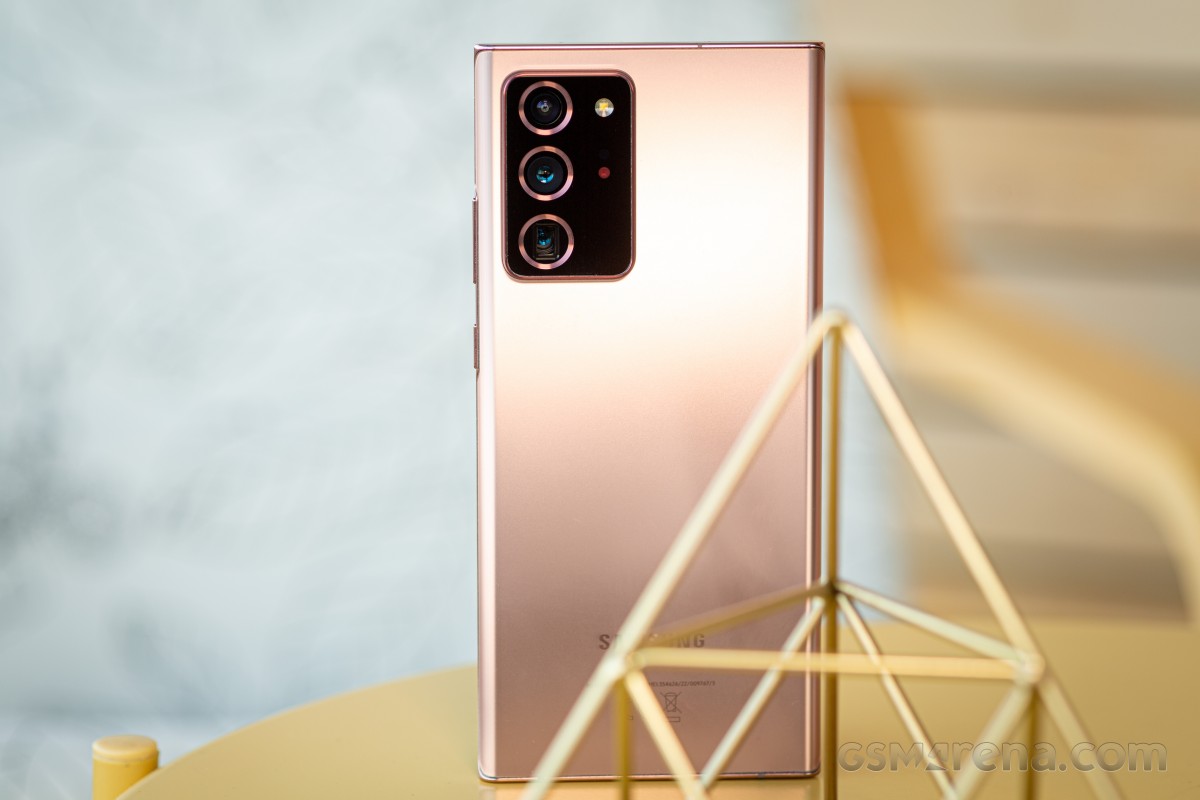
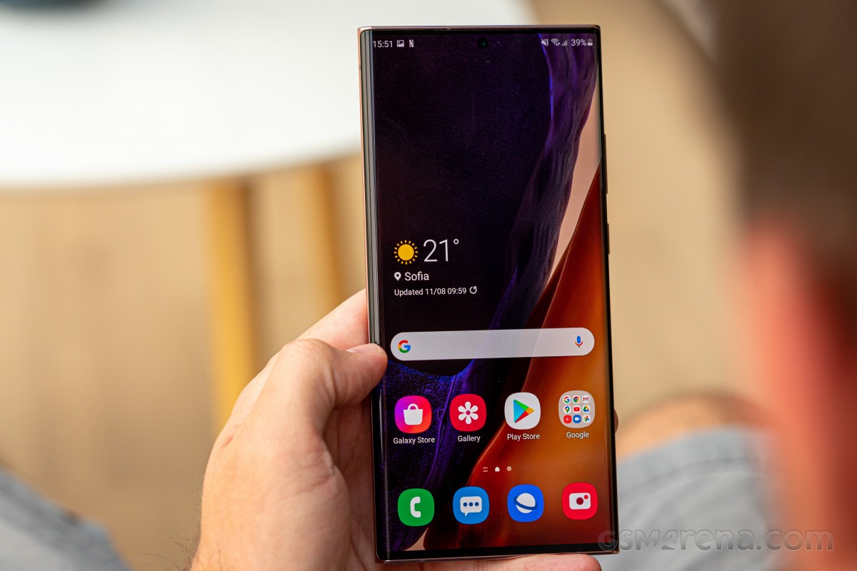
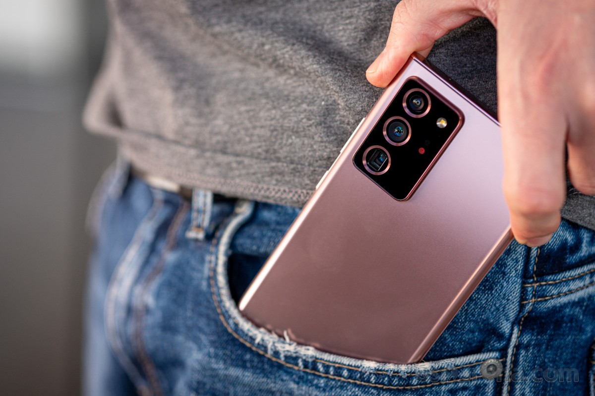
The Note20 Ultra is, in this reviewer's very subjective opinion, the best-looking smartphone ever made. It's also among the best feeling thanks to the back glass' satin-like finish, which additionally has the advantage of not showing fingerprints almost at all. It's still slippery, though, which is why it doesn't take the cake for "the absolute best feeling" because you can still get some anxiety about possibly dropping it.
The good news is that the new Gorilla Glass Victus that adorns both the front and the back is the most shatter-proof material ever put on an Android phone, and throughout two unwitting tests we can confirm that. We dropped the Note20 Ultra both on tiles from about 1m and on a carpet from around the same height with absolutely zero marks anywhere. That was a very nice surprise.
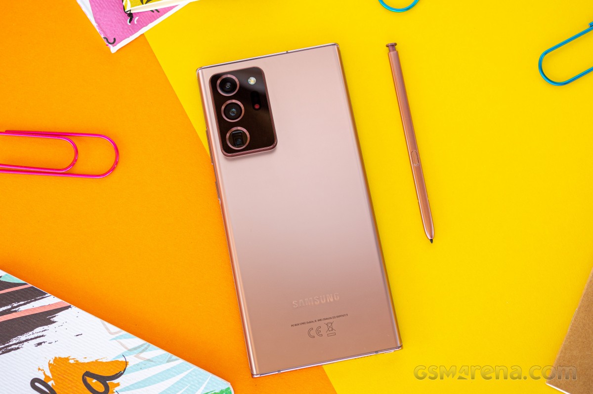
You are welcome to disagree, of course, but there's something about how it all comes together in the Note20 Ultra's design that is just extraordinary. Countless times so far we had thought we'd seen it all when it comes to the now traditional metal and glass slab design, and yet something always seems to come by to force us to realign our beliefs.
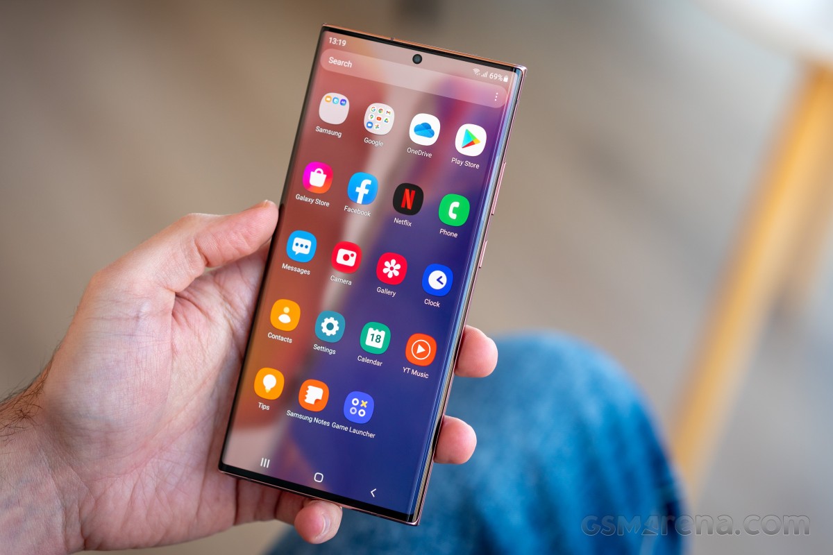
Take the screen bezels. We've seen small bezels a lot, but these are tinier. Take the screen curves. We've seen a lot of curved screens before, but the way this display 'turns' into the frame is second to none, and that's mostly thanks to the radius of the curvature, combined with the fact that the frame corners aren't rounded. The back glass curves at a very similar radius, and while the frame itself isn't exactly 'in the middle' between the two sheets, it's close enough that it does sort of give off a vibe of symmetry.
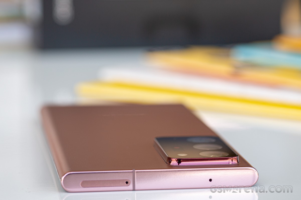
The flat top and bottom sides are a stroke of brilliance, as at their ends they get rounded to nicely showcase the aforementioned glass curvature. Funnily enough, the camera hump being so big basically ensures that you won't be able to 'sit' the Note20 up on its top side, while the S Pen converges to not let that happen for the bottom, so it's not about that, it's just about how aesthetically pleasing the flatness is.
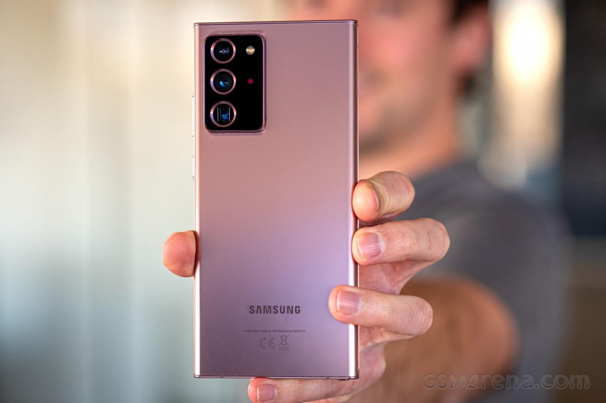
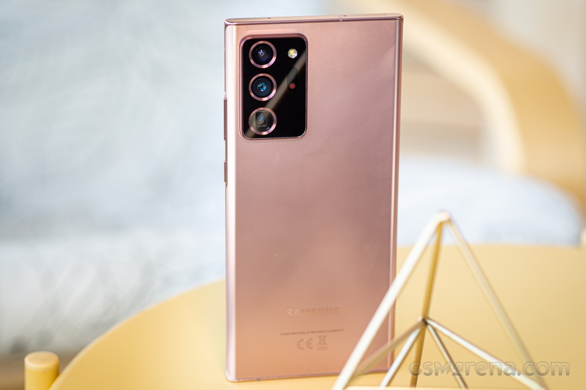
The back glass feels like satin to the touch, but also somewhat like a metal that has been satin-ified, not glass. And the humongous camera hump feels self-assertive in its hugeness, it doesn't want to hide itself under two-tone finishes or anything like that. The sensor cutouts are exaggerated but to a great effect, and we think this Samsung design team went in a good direction - that is, making the best of the situation.
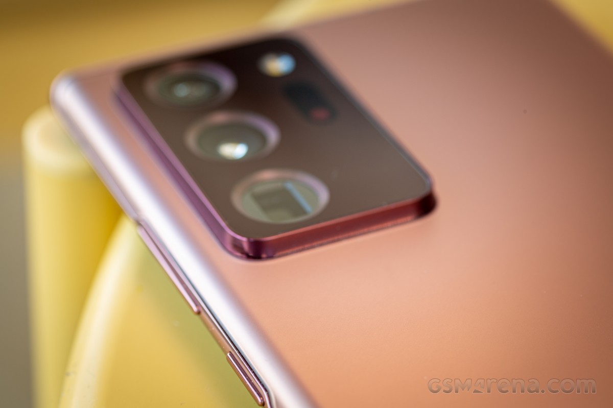
The hump is also instantly recognizable and iconic, although for that to take any hold in the public conscience the company would have to stick with it for another generation, which is not very Samsung-like (but has constantly benefited Apple as a strategy over the years).
The Note20 Ultra owns its hump, and while being unapologetic about it, it's not shouty or, dare we say it, ugly. There is, after all, a whole lot of tech hiding there, and that's not something to try to hide.
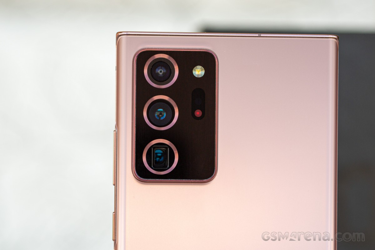
Build quality is as good or better than any top of the line smartphone ever made, the Note20 Ultra feels like one solid entity, and that perception is helped by its weight. It's not light by any stretch of the imagination, but it's not horribly heavy either (for its size). It's just about hefty enough that it feels like you're holding a bit of premium tech. It's also not likely to go unnoticed in a pocket, and that's down to the weight combined with its rather unique shape.
While not as boxy as some Sony smartphones, the Note20 Ultra is much boxier than any other mainstream flagship device, and that is one more thing that makes it unique looking. The corners of the display have only the tiniest of curvatures, and this makes it feel like the screen is even bigger than it actually is. It also means that holding the Note20 Ultra for an extended amount of time with one of the corners 'digging' into your palm is going to be a different experience than it would be with a curvier handset.
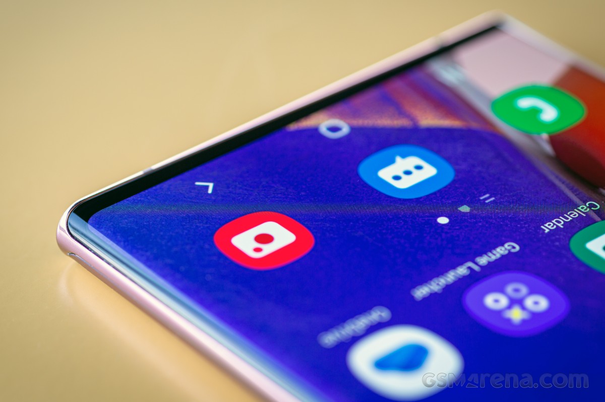
This one will make its presence felt, you never forget it's there, but while that can get annoying, it also has the opposite effect, which is of you constantly being reminded that you are using this uniquely shaped, amazing looking bit of high-end technology.
Width-wise, it's definitely at the edge of what this reviewer would call usable with one hand, and if you have smaller hands it's probably over that edge. However, if you're an S Pen fanatic, then two-handed use is a must anyway, so this might be a moot point.
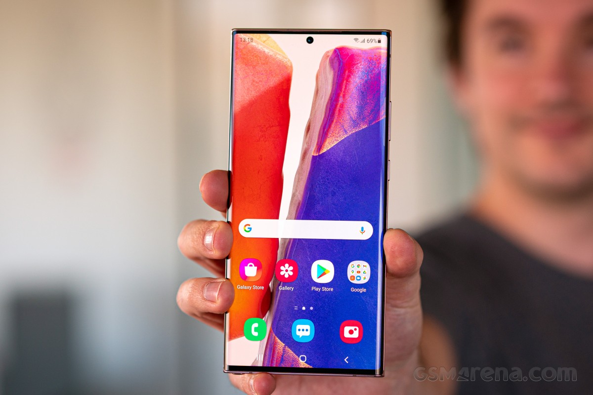
We want to take a second here to celebrate the fact that Samsung has managed to eek out the absolute maximum screen size it could in this form factor - the bezels, the tiny corner curves, the side curves - all of those work in concert to deliver what subjectively feels like by far the biggest screen-to-body ratio ever. And that's a rather magical thing to look at every day.
Speakers, vibration
The Note20 Ultra's stereo speakers are easily among the best this reviewer has ever heard. Even if the earpiece is pulling double duty as one of the channels and there isn't a dedicated speaker up top like we've seen in some other phones, the results here are truly outstanding. The quality is great for something coming from a phone, and there's plenty of volume too. In fact, we'd rate these as the loudest (subjectively) we've ever heard, while in quality the Mi 10 Pro seems to still have a slight upper hand. The differences are minute, however.
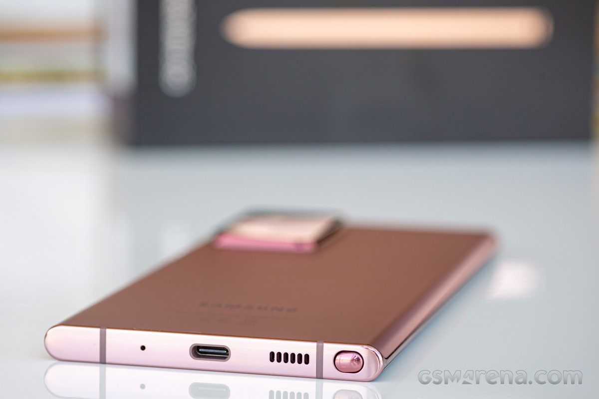
Quick note about the earpiece, though: it seems to have a much wider dynamic range at the top end than any other we've tried, which is great on paper but also means that you're being exposed to many more high pitched sounds than when using another phone, so if you are sensitive to such noises, some calls (especially where the person you're speaking to has a lot of random noise around them) can become grueling.
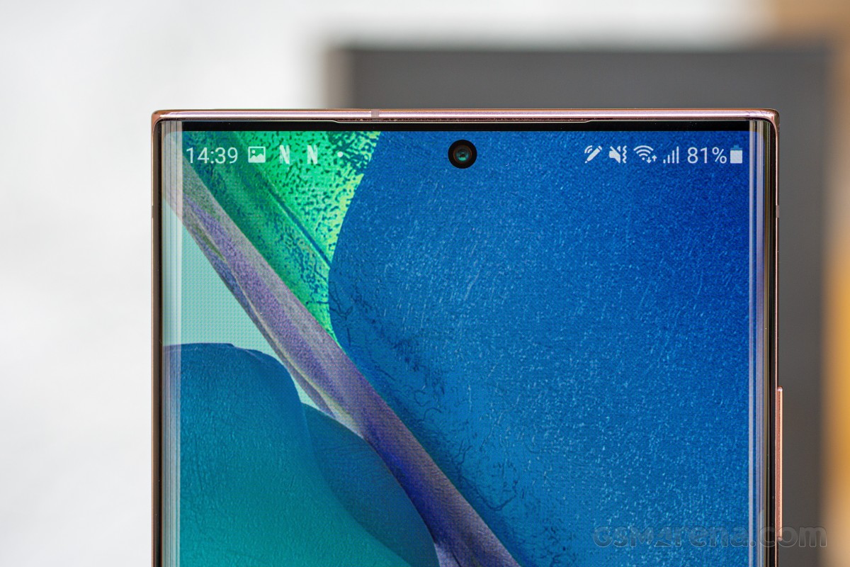
The vibration motor on the Note20 Ultra is solidly among the Top 3 best ever put inside a smartphone, but compared to what Xiaomi has been doing for its flagships in MIUI 12, we feel like it's underused. There are a lot of interactions with the UI that could benefit from a gentle vibration here and there, and yet they don't. And then the fingerprint sensor could have some haptic feedback when unlocking, like every other phone with an in-display unit, but Samsung is still not willing to go there for whatever reason.
Anyway, where the vibration motor is used, you'll be very happy. The experience of typing with haptic feedback is excellent, for example, and the motor is strong enough that ringing vibration patterns are both very deep (so you can feel them) but quite loud too (so you can also hear them). This may irk some people, but if the point is not to miss a call no matter what, the job here is being done admirably.
S Pen
Here's an unpopular opinion: the S Pen is too small, too short, too narrow, too light, too flimsy, too hard to get out of its slot, too hard to put back in, and for most people on Earth (who are right-handed), it's also in the wrong position. So why does it exist again? For Samsung to get away with launching two flagship smartphones per year, every year? Remember when Sony tried the exact same strategy and everyone was put off by it? Well, if only Sony gave one of its two yearly flagships a 'differentiating feature' like the S Pen, perhaps the story would've been different.
Had the S Pen been bigger, thicker, heftier, and easier to pull out and put back in, there would possibly be a higher number of people demanding styluses for their smartphones. But there aren't, because if the S Pen is the epitome of the stylus, then most people, for most things, don't actually have any need for a stylus for their smartphone. So maybe a case is the way to go - like the S21 Ultra that supports the S Pen, but without a slot to house it. Instead, you can get a special case that also stores the stylus. Such an arrangement could enable bigger styluses, which would then instantly become more usable.
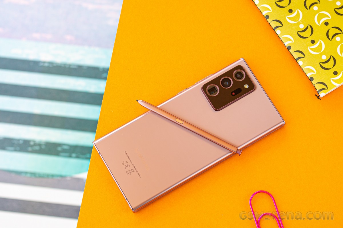
This is not to say that the S Pen as it is isn't useful. It definitely is - sometimes. Think of it as a tablet. It's nice to have, but not necessary per se, unless you're in a job (or have hobbies) that requires you to use it constantly. We'd assume not a lot of people are in such a position, though, judging by the sales of the Note line over the years compared to the S line. For everyone else, the S Pen is a good feature that doesn't make or break the experience of using the Note20 Ultra. We'll be honest - aside from using it intentionally in order to be able to write about it here, we only pulled out the S Pen 'naturally', without thinking about it, two or three times over our extended period of using the Note20 Ultra as our one and only smartphone.
Let's face it, right now the S Pen is the only thing making a Note a Note anymore, as big screens are everywhere - even Apple gave in to that trend because it had to. People like larger screen areas, and seem to be mostly meh about styluses. But, if you do get a Note20 Ultra, you'll be happy to know that the S Pen's latency has been cut down to just 9ms, which makes its interactions with the screen near-instant. You can definitely feel that improvement in use compared to previous Notes and their 42ms latency, these aren't just marketing numbers.
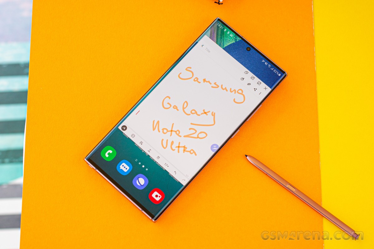
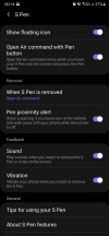
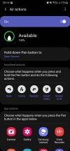
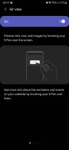
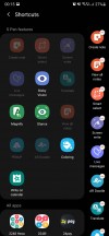
All of the traditional S Pen features are here. You have Screen-off memo which is self-descriptive, and when you pull out the stylus with the phone unlocked you're shown the Air command menu of quick actions. The shortcuts are customizable of course (this is a Samsung, after all), and you can turn off Air command entirely if it annoys you. Screenshot taking is heavily improved by using the S Pen, there isn't a thing you would want to do to a screenshot that you can't do here. And with Air view, you can do stuff by simply hovering with the S Pen above the screen (think scrolling up and down, enlarging image previews, seeing calendar details, that type of thing).
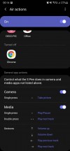
Additionally for the Note20 Ultra there are Anywhere actions, which is a way to use the S Pen to trigger actions on the phone from further away. This seems like a great idea for the Camera app so you can remotely snap photos, and some will definitely enjoy the ability to control PowerPoint slides from a distance.
You can also now use the S Pen to go Home or Back or to Recents, if for some reason you have the stylus in hand but can't or don't want to touch your phone for navigation through its UI. You can also assign Anywhere actions to start up any app of your choosing, and all of this seems nice on paper, but most times it's much easier to just use your phone to do things on your phone.
Display
This is one of the best displays ever put in a smartphone, quality-wise. Like the one in the S20 Ultra, however, it falls short in features. We're talking about the fact that you can't get both the maximum resolution and the maximum refresh rate at the same time. Samsung still makes you choose, and this is still entirely unacceptable for a flagship device that costs this much. We were hoping that, like other issues with the S20 Ultra, the Note20 Ultra would fix this, but no, that was pushed to the S21 Ultra.
So 2020 was an entire year of Samsung flagships being outcompeted on this front by some Chinese companies. On the display front. For AMOLED panels. Of which Samsung Display is by far the world's biggest maker. This doesn't make any sense.
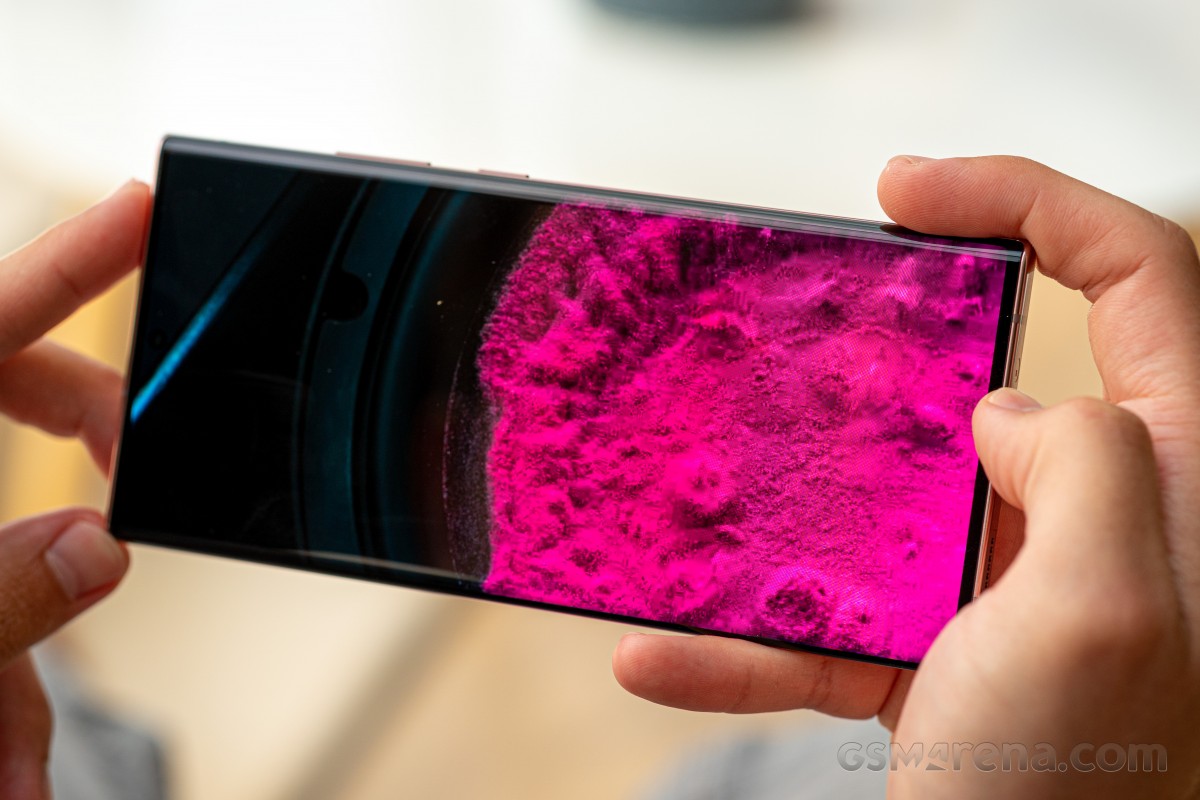
Because we had to pick between QHD and 120 Hz, we obviously chose the latter, as the higher refresh rate makes a much bigger impact in the day to day experience of using the phone. This has meant we had to use one of the most expensive non-folding smartphones ever at a resolution that is essentially extended Full HD, something that $200 phones can also now boast. Yes, we're irked, because this is irksome. Although, in fairness, FHD+ is the default resolution setting (still, for some reason), and we don't know how many 'non-techies' would ever change that.
Technically it's not 120 Hz all the time, the setting is Adaptive, and will boost refresh rate up and down based on what you're doing. In practice, this works well enough that you won't see any huge glaring issues anywhere, and we're assuming some battery is being saved by not going to 120 Hz all the time.
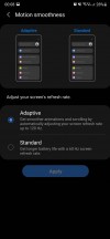
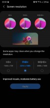
Motion smoothness and resolution
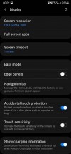
Before we get to how amazing the quality of this panel is, let's address the curves. Yes, there are curves, but somehow accidental touches are much less of an issue on this phone than they are on the S20 Ultra. Perhaps the slightly different curvature radius is to thank for this unexpectedly good development, but where the S20 Ultra was bordering on insanely annoying with its accidental touch issues, the Note20 Ultra is well within the realm of 'something you can get over even if it does happen from time to time'.
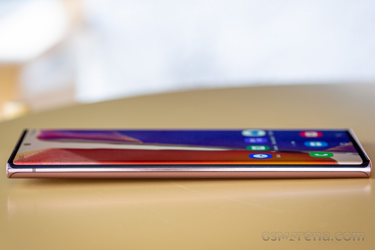
In fact, we don't remember another Samsung flagship with a curved screen that we've used for a long-term review to have less accidental touch issues, so it seems like Samsung has finally managed to alleviate these - much later than practically the entirety of its competition, but still. Don't get us wrong, we did encounter accidental touches, but only a few times a day, and we never put a case on the phone (because we were so in love with its looks and feels, as described ad nauseam in the Design section). If you, like most people, will slap a case on it, that may help even more to make accidental touches just a strange nightmare from the past.
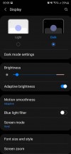
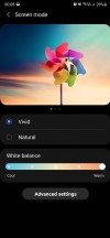
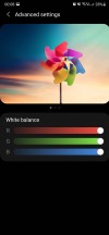
The display's maximum brightness is incredible, there's no other way to put it. It's clearly the easiest screen to see even in direct sunlight - easiest out of any other phone, ever. It also gets very dim at night, as it should. We like Samsung's newly simplified Screen mode settings, where you pick Vivid or Natural and then your preferred white balance. For reference, we stuck with the Vivid default (although Natural is more accurate, we like the 'pop' in colors), and then moved the white balance slider to the maximum Warm setting, because anything else makes whites look hilariously blueish. Of course, you can adjust individual RGB sliders too if you're one of those people who can't live without such granular control.
Display features
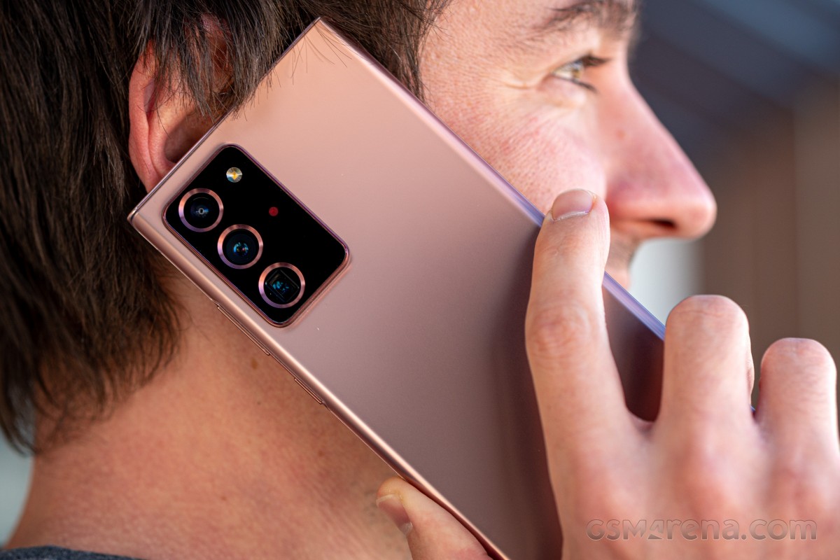
One of our few gripes with anything related to the experience of using the Note20 Ultra's hardware has to do with the proximity sensor, which is just appalling. We're not mincing words, we really shouldn't be subjected to an experience this bad in a device this expensive. It seems like Samsung went with one of those accelerometer-based proximity sensors that OnePlus phones used to get flack for back in the day, and the results are about as bad.
When you're on a call, it's never clear what to expect - the screen may have stayed on even if the handset is on your ear, a lot of times when you take the phone away from your ear the screen stays off, and there's also a lot of random behavior in between these extremes. We still haven't found a reliable way to trigger the proximity sensor after many weeks of frustration, but since it's probably accelerometer-based, exaggerating the movements of your arm sometimes works to trigger it - so when you take it away from your ear to look at something, be laughably ridiculous about the motion and it may work. The same goes for putting it back near your ear to continue the conversation.
That frustration aside, the rest of the display features work exceptionally well. Auto brightness is so good by default that we only remember manually adjusting it two or three times, in total. And, of course, it should learn from your manual adjustments so you never have to adjust the same way twice (for the same ambient light levels).
One area of possible improvement is in responding to light levels that are higher at the back of the phone. Samsung flagships have gotten us used to having two ambient light sensors, one on the front and one on the back, specifically to aid with this, but we found the Note20 Ultra a bit worse at using its backward-facing sensor than previous Samsung flagships, for what it's worth. We're not sure if the rear sensor is gone or just tuned worse, but either way, this isn't a huge issue most of the time.
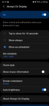
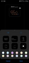
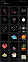
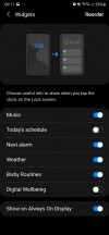
The Always On Display in One UI 3.0 is among the most customizable out there, with a bunch of widgets to pick from, and it works very well as you'd expect. You can schedule it, go with 'tap to show', have it show music information, pick its orientation, and there's a seemingly endless selection of clock styles and even GIFs to add to it. If none of those works for you, then you can add your own image from Gallery or your Bitmoji. The blue light filter is present, it works, you can schedule it, and that's about all we can say about it. It does its job, and it does it well.
In-display fingerprint sensor
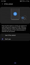
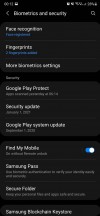
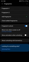
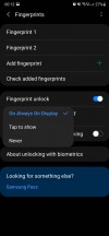
Samsung keeps sticking with ultrasonic in-display fingerprint sensors when the entire mobile world has chosen optical ones. The Note20 Ultra's is no different, but with One UI 3.0, we can finally say that it feels about on par, speed-wise, with an optical sensor (after you disable both Show animation when unlocking from Fingerprints settings and Show unlock transition effect from More biometrics settings - we could rant at length about why these toggles even need to exist, but we'll spare you).
On one hand, this is great, because ultrasonic scanners are ever so slightly more secure and should be able to work better with wet fingers (although they do seem to be much less accepting of screen protectors than optical ones). On the other hand, if this was fixable, it means it was always a software issue, so we're left scratching our heads as to why it took Samsung this long to improve its flagships' usability in such a huge way. Keep in mind that the sensor itself has been the same hardware part since Samsung started using these ultrasonic ones.
So the culprit for the speed delta between ultrasonic sensors and optical sensors has always been One UI, which is just mind-boggling.
Anyway, the sensor here is very accurate (we've only had a dozen or so misreads in literally thousands of unlocks), and now feels on par with the fastest optical ones from the competition. At least it does if you're paying attention, and have another device to compare with nearby. Otherwise, it will still feel slower because there's no haptic feedback when unlocking. The reason why other companies use haptic feedback is so that it will distract your brain for a split second, and thus your perception is that the unlocking happened faster than it actually did. It's smart, and we don't understand why Samsung doesn't want to do the same.
Face unlock is present, it works, but it's slow compared to most, if not all competing 2020 flagship smartphones. The fingerprint sensor is faster in 99% of cases, but you may still want to set up face unlock for that odd time when you can't touch the sensor. Do however keep in mind that this is just camera-based, so it's much less secure than fingerprint authentication is. And since it's also slower... we almost never used it, aside from to try it and see how it goes.
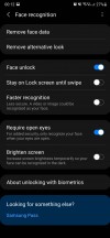
Final note is that if you dig into Settings, you'll find a knob you can press to make authentication faster, but then it's even less secure and can easily be fooled by a photo of your face. If you turn that on, though, then the speed is closer to what Samsung's competitors are offering. Oh, and there's a toggle for checking that eyes are open too, you should definitely leave that on.
Performance, smoothness
What we have here is the Exynos version of the Note20 Ultra, and as such all our thoughts in this section are influenced by this fact. The phone is fast, as a device with a top-of-the-line chipset should be, and we have never seen it crashing or freezing in the face of adversity - no matter how much we threw at it.
So far so good, if you're paying this much money for a non-foldable phone you might as well be assured that you're getting a proper top-notch experience. And you are, from the performance standpoint - unless you have the Snapdragon model, which is even better in this regard.
When it comes to smoothness, we were surprised. The Galaxy Note20 Ultra, running One UI 3.0, is by far the smoothest Samsung smartphone we've ever used. Much more so than the Galaxy S20 Ultra was with One UI 2.x, although we haven't retested that one with the latest software, so things could have improved there too.
All that said, there are many other devices out there that are smoother than the Note20 Ultra, Exynos version, with One UI 3.0. Here's a random list: Huawei P40 Pro and Mate 40 Pro, Oppo Find X2 and Find X2 Pro, Xiaomi Mi 10 and Mi 10 Pro. Those are all in a different league when we're discussing smoothness in particular.
The Note20 Ultra is part of the 'second best' league if we were to call it that. It's definitely smoother than any mid-ranger made by any company, that's for sure, it's just that it can't beat all of the other flagships that came out in 2020. Which is a shame, considering that it's among the most expensive.
Of course we used it with 120 Hz, and we shortened the animations to create an even better impression of smoothness (but that's what we do with all other phones too). Even if One UI 3.0 is a big step forward in smoothness compared to 2.x, Samsung still has a lot of work to do in this respect, as it's now been overtaken by a lot of the competition. Of course, smoothness is far from everything that matters about a phone - but it's one of the most frustrating issues to encounter after paying so much for a flagship device.
So, on the smoothness front, here's the short version: if you're coming from any other Samsung, you'll be impressed. If you're coming from a 2020 flagship made by another company, you might be in for a slight shock.
Battery life, charging
Battery life on our Note20 Ultra has been good throughout the time we've spent with it for this long-term review. It was also consistent, which is great to see. We feel confident saying that for anything but the most intense use cases, it will last you one full day off the charger.
However, this is far from our long-term review battery champ. Some of the capacity understandably had to be sacrificed in order to make room for the S Pen, but even so 4,500 mAh is nothing to scoff at. While it did get us through most normal days, the battery never ever lasted us into the second day, something we've seen before from other phones.
We would tell you about our screen on times, but we can't because Samsung's way of showing those is very backwards. You don't get a screen on time from when you last fully charged the device, instead the Battery section tells you how much time has passed since the phone was last fully charged, and the Digital wellbeing section gives you a screen time per calendar day. That's fine and dandy if you go to sleep and set the phone to charge before 12 AM each night, but we don't so you should view the numbers in the screenshots below as mere vague approximations of what to expect.
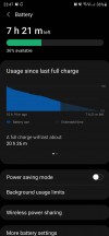
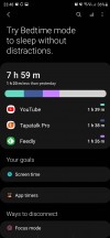
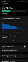
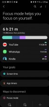
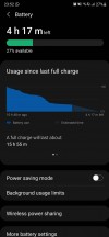
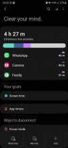
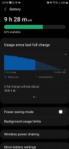
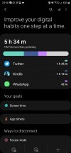
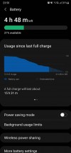
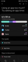
Battery life (usage since last charge/screen time per calendar day)
As usual, our use case involves 12-16 hours off the charger each day, with mostly Wi-Fi connectivity, around an hour on 5G, around half an hour of GPS navigation with Waze or Google Maps (and location otherwise always on), Bluetooth always on with about an hour of music listening and an hour or two of calls.
Charging speed is slower with the built-in charger than most of the competition, and by a lot in some cases. A full charge from zero takes well over an hour, and that's what a lot of mid-rangers are achieving nowadays. Samsung really needs to up its game here, we're not hoping for crazy charge times, but around 45-50 minutes would at least be decent in this day and age. Almost 50% more than that really isn't, in a world in which some competitors go from zero to hero in less than 40 (or even less than 30) minutes.
We like the flexibility that the built-in wireless charging gives you, but we ran into a hilarious issue with an upright wireless charger we had lying around. Because of how big this phone is and how huge its camera bulge is, we couldn't get it to work, because the hump hit the charger pad, and was thus distancing it from the phone's coil. With horizontal pads this should be a non-issue, and even with other upright chargers you may have better luck, we just thought we'd mention this here because it was funny.
Updates
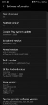
The Note20 Ultra now runs Android 11 with Samsung's brand new One UI 3.0 on top. The update arrived on our unit in December, and we think it's a pretty big step up compared to the previous One UI iteration. There's a very noticeable increase in smoothness overall, and we haven't experienced any bugs.
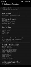
In the meantime, we've also received the January security patch, and speaking of security updates, Samsung is amazingly good at pushing these out in a timely fashion - and not just to its flagships or most recent devices. Aside from Google, it's the only company from which you can expect these updates to arrive consistently month after month, and we commend it for having achieved this. Sometimes, it even sends out a month's security patch before Google has had the chance to do the same for its Pixels, and that just solidifies how much of priority security has become for Samsung in recent years. In a word, all we can say is - kudos.
Big feature updates, on the other hand, still take a few months to be released from when Google first outs them. There are slight timeline improvements here too, compared to what the situation was like a few years ago, but they aren't as big. Still, Samsung has settled into a consistent release schedule with the new Android version arriving on its most recent flagships around the end of each year or beginning of next year, so you do have a high degree of predictability. And through its open beta builds, Samsung aims to catch any possible bugs before the stable rollout commences, which in theory should mean a less stressful post-update experience for most people.
So, to sum up the update situation - the support you're getting for the Note20 Ultra on the security patch side of things is second to none, while for new Android versions you'll wait more than owners of some other phones, but, in our subjective opinion, not long enough that it really becomes bothersome. After all, most people are probably not intimately acquainted with Google's release schedule for new Android iterations, so what they will most appreciate is Samsung's consistency in delivering new updates somewhat yearly.
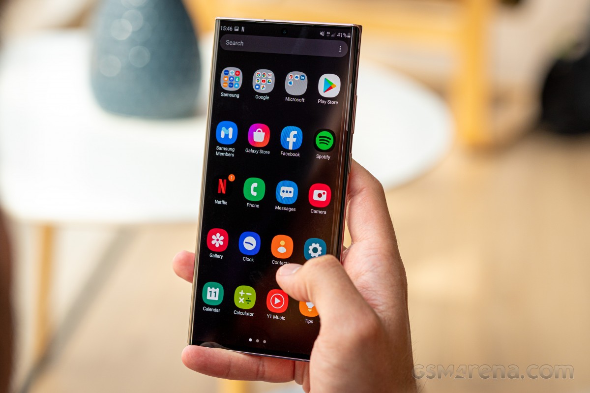
All this said, new Android versions lately have had fewer and fewer huge new improvements in them that would require a quick update to take advantage of, and since One UI is one of the heaviest skins around, a lot of what Google announces for a new version may simply get lost underneath all changes that Samsung makes. The point here is that being on the absolute latest Android version is much less important, from the perspective of your day-to-day user experience, than it used to be. And that's a good thing because it means Android is a mature platform, and there aren't any huge glaring things that need to be fixed anymore. It's all an incremental march of improvements these days.
One UI 3.0
We feel like we say this with every new iteration of Samsung's Android skin, but here we go again - One UI 3.0 is the best version of One UI ever. Although the changes compared to its 2.x predecessors aren't big enough to require any sort of learning curve, it's improved in many small ways, and this all adds up to the best user experience we've ever had on a Samsung smartphone.
We've already reviewed One UI 3.0 itself, if you're interested in a full rundown of what's new and what's different, make sure you don't miss that feature. Here we'll list some things that have affected our day to day use of the Note20 Ultra for this long-term review, but keep in mind that this is in no way meant to be an exhaustive list of all software features - that would eat up just about the entire space of this long-term review.
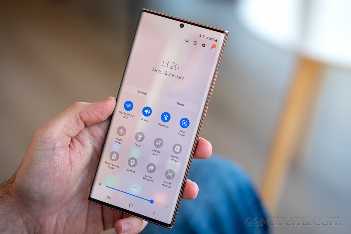
And that's because yes, One UI is still incredibly complex, and, dare we say it - cluttered. There are so many features that simply going through all of the Settings menu items would take any reasonable human being a solid weekend, but the good thing is that most of them can just be left as they are in their default states with no need for tinkering - unless you want to change a specific thing.
One of the exceptions to this rule, at least in our book, is the fact that by default you only see notification icons on the lock screen, and not the full content as it is shown in the notification pane. This has always felt like a baffling decision on Samsung's part, because the default setting requires more steps to do something that's just a one-step process in every other Android skin out there, but hey, you can change it if you want.
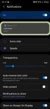
Icons only is the default for lock screen notifications
Actually, come to think of it, "you can change it if you want" seems to be the general mantra of One UI, version 3.0 included. There isn't any other skin out there that gives you this amount of customization options, but we always felt this is a bit of a cop-out on Samsung's part. See, it's easy to tell someone to make a choice for themselves every single time, for every single thing. It's much harder to have thought about things yourself and 'chosen' for them. If you make good enough choices, this has the benefit of not making things feel daunting for the user, sometimes at all.
Apple, for example, seems to be in the exact opposite philosophical extreme as Samsung, where a lot of things are restricted seemingly just for the sake of "let's not confuse people with choice". Samsung, on the other hand, has layers upon layers upon layers of choices for you to make. Neither concept seems like the best to us, because they are extremes - we feel like the best possible user experience is created somewhere in the middle, but obviously, you may disagree.
Philosophy aside, One UI 3.0 looks a lot like One UI 2.x, except in some places. The notification area's background is now semi-transparent, for one, all of the design elements have been tightened, and the fingerprint sensor gets a new icon - and the icon is always visible on the AOD (okay, that's a setting, too).
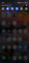
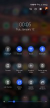
Notification area and Quick Settings
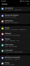
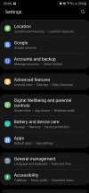
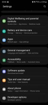
In terms of general features, not a lot has changed. One UI 3.0 still gives you a near endless Settings menu with many layers, the top level sections are still separated in groups, and now you get some more text under each heading telling you some of the things you should expect to be in there. Overall, this is a nice (if very small) usability improvement. If you still find it hard to locate specific settings, the search function continues to work very well.
Launcher
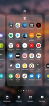
The built-in launcher still has two annoying things about it for us: the Samsung Daily screen at the left of your leftmost home screen, and the horizontally scrolling app drawer that isn't even sorted alphabetically by default. The sorting can be fixed, but because Samsung allows folders in the app drawer, you're still going to have issues finding some apps (such as those from Google and Samsung itself) if you're quickly trying to locate them using the alphabet. And that is because they live in folders.

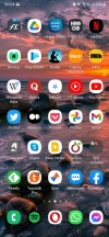
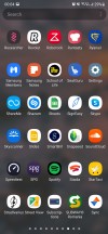
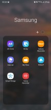
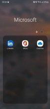
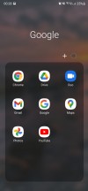
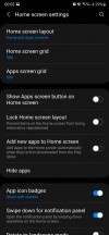
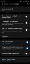
Launcher: Samsung Daily, home screen, app drawer with folders
We're going to say this again: you swipe up for the drawer, it having vertical navigation just makes sense because it's the same motion that you just continue. To navigate horizontally, you have to break that motion, and that always wastes a few milliseconds here and there.
Of course, you don't need to stick with the app drawer at all - Samsung offers the iOS style all-apps-on-home screen organisation, too.
Moving on to the Samsung Daily screen, this is still by far the laggiest, stutteriest part of the entire software. It always lags when you go to it, it always stutters while scrolling. Every. Single. Time. Samsung has had ample time to fix this, and didn't. Not to mention it was never so useful so good thing you can turn it off (it's a setting).
We're glad that Google's Discover Feed has replaced the Samsung Daily in the latest One UI 3.1. For now, it is reserved to the S21 family but will probably come as an update here, too.
Dark mode, gestures, recents
Dark themes and gesture navigation have basically matured in the Android world at this point, and that's a very nice development. Took a long time, but we're finally at the point where we don't really have a lot to say about either, since they consistently work as intended on all phones.
We are fans of dark themes, so we switch to those on every device we long-term review, and the Note20 Ultra was no exception. The only thing we missed is the ability to force the dark theme onto apps that don't provide their own (Facebook is still, amazingly, in this situation).
Otherwise the dark mode on offer here is pleasantly dark (and "AMOLED black" mostly, which is a nice battery life enhancing touch), it is schedulable of course, either with arbitrary points of your choosing or based on sunrise and sunset at your location.
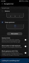
Google has standardized the way gestures work on Android, and so every phone basically gets a very similar system, where you swipe up to go home, swipe up and pause to reach the multitasking menu, and swipe in from the sides to go back.
By default you get a useless 'pill' shaped white line at the bottom to remind you that gesture navigation is turned on, and you can swipe across it to quickly jump between apps. Or, like us, you can simply turn it off, and reclaim that wasted screen real estate (it's a setting).
Unlike some other Android device makers, Samsung has fully implemented Google's gesture solution, though, which means that there isn't any vertical cutoff for the Back gesture, you can use the entirety of the sides for that. This creates a conflict with slide-in navigation drawers that some apps still employ, but thankfully most of the apps we use on a daily basis have moved away from that. If you do encounter an app which requires you to swipe to show its navigation drawer, there will be some fiddling involved, because the Back gesture and the drawer showing are triggered by swiping from different points.
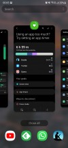
The Recent apps menu is horizontally scrolling, as most are these days (only Xiaomi seems to not be convinced), and at the bottom you get four icons of suggested apps to jump to. The algorithm powering this feature works amazingly well in our experience, constantly predicting which app we wanted to switch to. Obviously, it's much easier to just tap one of those four icons than scroll through the app carousel in the middle.
When you bring up the Recents menu by employing the swipe up and pause gesture, the app that's in the foreground is the previously used one, so you can quickly switch back and forth between apps this way. You can achieve the same effect if your swipe up gesture is small and then turns into a sideways swipe - this does what swiping across the 'pill' at the bottom of the screen would, if you had it there. Like we mentioned, we think it's an eyesore, so we used this alternative to it instead.
Camera
The Note20 Ultra reuses the main camera sensor from the S20 Ultra, but with a very important tweak: the Note got a laser autofocus system that greatly improves focusing at close distances compared to the S20 Ultra. The latter was notoriously prone to focus hunting and randomly losing focus, and that has mostly been fixed for the Note20 Ultra. Not entirely, but right now the slight focus issues are definitely something you can live with, which isn't something we were able to say for the S20 Ultra in our long-term review of that device.
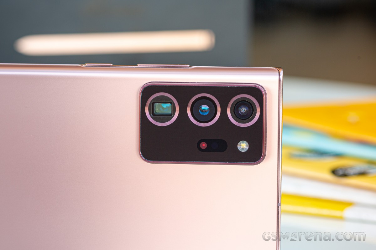
The ultrawide camera is reused as well, and thus it doesn't have autofocus - it's a small change that you only get in the S21 Ultra. Samsung is really delivering upgrades drop by drop.
You can sort of use the main sensor on the Note20 Ultra for closeups and because it's so huge it also produces among the most natural bokeh of any phone. That said, the focus plane is still quite shallow, so if you're shooting big objects that take up a lot of the frame, you will find that their edges aren't in focus. That's a hardware limitation of the sensor here, and there's nothing Samsung can do about it in software unfortunately.
The 12 MP 5x optical zoom periscope telephoto camera is different from the one we saw in the S20 Ultra, which was a 48 MP 4x unit. The Note20 Ultra's is smaller, and we'll see how that affects image quality in a minute. The selfie cam seems to be swiped directly from the S20 and S20+, with identical specs and 10 MP resolution.
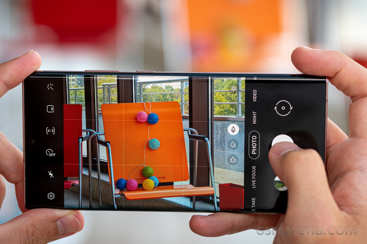
Samsung's camera app has remained the same, with a familiar UI. It's very easy to use though, and we really like that you can choose which shooting modes appear in the carousel. As with seemingly every other camera app out there, you swipe left and right to switch modes, while vertical swipes switch between rear and front cameras.
Zooming is designated by using Samsung's trademark tree icons, and thankfully the zoom tree takes you straight to the native 5x level of the periscope camera (whereas the S20 Ultra would take you to 5x even if 4x was its native zoom level). So a bit of sanity was restored. Continuing that trend, the maximum zoom level is 50x, gone are the 100x Space Zoom shenanigans, and they definitely won't be missed. Even at 50x, shots look like oil paintings, so we'd refrain from ever using this level unless absolutely necessary.
Samples
During the day, the main sensor produces images that are instantly recognizable as coming from a Samsung smartphone, with ample sharpness (sliding into oversharpening a lot of times, especially when dealing with certain textures) and saturation. The shots are also ever so slightly warmer looking than actual reality, but overall Samsung's 'enhancements' do make for very appealing images. It's like the company has managed to find a way to improve upon what our eyes see, in ways that mostly don't seem too overdone. Fans of accuracy will have to look elsewhere, though (or use the Pro mode).
Dynamic range is outstanding and noise is almost non-existent. As usual for long-term reviews we have refrained from capturing samples at the sensor's full resolution, because these pixel binning sensors aren't really meant to be used that way. While you may get a tiny bit more detail by going that route, you are sacrificing everything else in the process.


Daytime samples from the main sensor
The ultrawide has a similar colorful saturated look, with good dynamic range and decent levels of detail, although overall sharpness could be better. Lens correction works well to correct lines along the edges.


Daytime samples from the ultrawide
The telephoto produces sharp pictures during the day, with the same 'larger than life' colors and very low noise. These are very good overall.
At night the main sensor delivers images with great dynamic range, good color saturation, lots of detail, and low noise, if not the lowest.


Nighttime samples from the main sensor
If you use Night Mode on the main sensor, you will get a ton of contrast, along with improvements in dark areas and reigned in highlights, with less haloing around light sources - although it's not almost obliterated, as we've seen in other phones. Night Mode images are pretty quick to shoot too, so more often than not it may pay to go with this instead of Auto if you can.


Night Mode samples from the main sensor
The ultrawide struggles at night, less than ultrawides on mid-rangers, but more than other ultrawides on flagships (the Huaweis come to mind). It produces decent images overall, when there's still some light around. Saturation is good and the pictures are pleasant to look at, although obviously inferior to what's coming from the main cam. There is however a steep cutoff when you venture into less well-lit spaces, you'll struggle to tell what exactly it was you were trying to shoot.


Nighttime samples from the ultrawide
Add Night Mode to the ultrawide and the darker areas are brightened, bringing to front a lot of detail that simply wasn't there in Auto mode. There's less noise too, while detail in the already lit up areas suffers but not too much. The only issue is that it takes around 7-9 seconds to capture a Night Mode shot with the ultrawide, and that's kind of a lot to sit still trying not to shake. So at night we think you should only go with the ultrawide if you absolutely must fit more into the frame than the main sensor allows for. But if you do need to use it, then Night Mode would be the best way to go.


Night Mode samples from the ultrawide
The telephoto at night is only used when there's enough light around, otherwise the phone switches to using a crop from the main sensor. When the periscope is being used, it shoots reasonably sharp and detailed photos with nice looking colors and decent dynamic range, although with plenty of noise too. If instead you're served a crop from the main sensor, then things are worse, sometimes bordering on unusable blotchy messes. You can tell from our samples which was which, undoubtedly.
If you employ Night Mode for zoomed shots, things do improve somewhat thanks to the longer exposures, but you're still going to struggle to find any such shots usable unless you're surrounded by plenty of light. And there's also the disadvantage having to do with how long it takes to capture a Night Mode shot, except, unlike for the ultrawide, for zoomed pictures the difference in quality isn't as huge.
Selfies are weird to capture because by default you're shown a crop of the sensor, a zoomed in view if you will. The camera would automatically switch to the full view when it detects more than one face in the frame. Alternatively, a toggle hidden deep in the camera settings would let it remember the last used framing setting but we can only guess why this isn't on by default.
Selfies come out okay during the day, with good detail levels, though colors can be muted compared to what the rear cameras give you. Dynamic range is excellent, and Live focus (don't call it Portrait mode) is very good for a single-camera solution. It can generally obtain good subject separation, even if it's not perfect all of the time.


Daytime selfies, normal/wide, Live focus off/on
At night the quality predictably goes down, and as with all standalone selfie cameras (that aren't the rear ones rotating towards you like in the Zenfone line from Asus) it's best to stick with places where there's at least some ambient lighting around, in order for the resulting shots to be even barely usable. Below you can see samples in Auto mode, Night mode, and with Live focus.


Nighttime selfies, normal/wide, Night mode off/on, Live focus off/on
To sum up our camera experience, the Note20 Ultra has a very competent system in tow, which is definitely among the best out there. To our eyes, though, it's definitely not the best at anything. The Huawei Mate 40 Pro/Pro+ and P40 Pro/Pro+, as well as the Xiaomi Mi 10 Ultra all rise above it in the camera department, and not by a small amount. However, the differences are sometimes only obvious when you're looking for them, so for most people posting primarily to social media, the Note20 Ultra has the advantage of 'the Samsung look' which seems like it was tailor made for grabbing your glance while you're scrolling through Instagram.
Conclusion
The Galaxy Note20 Ultra is, in our subjective opinion, the best flagship smartphone Samsung has ever made. We're not counting the new S21 Ultra just yet, because it's still too fresh out of the oven, but that one aside, this is peak Samsung, clearly.
Whether the Note20 Ultra is also the best Galaxy Note ever made is harder to ascertain, primarily because the moving of the S Pen to the left side might impact the usability of what has remained the only clear differentiator between the S and Note lines. If you're right handed, that's not a great position for the S Pen to be in, there's no way around this. You can get used to it, but it's definitely not ideal. On the other hand (excuse the pun), lefties all around the world will definitely be happy, even if their numbers aren't as high - and we're assuming the amount of fans the Note line has out of those who are left handed is a much smaller number still.
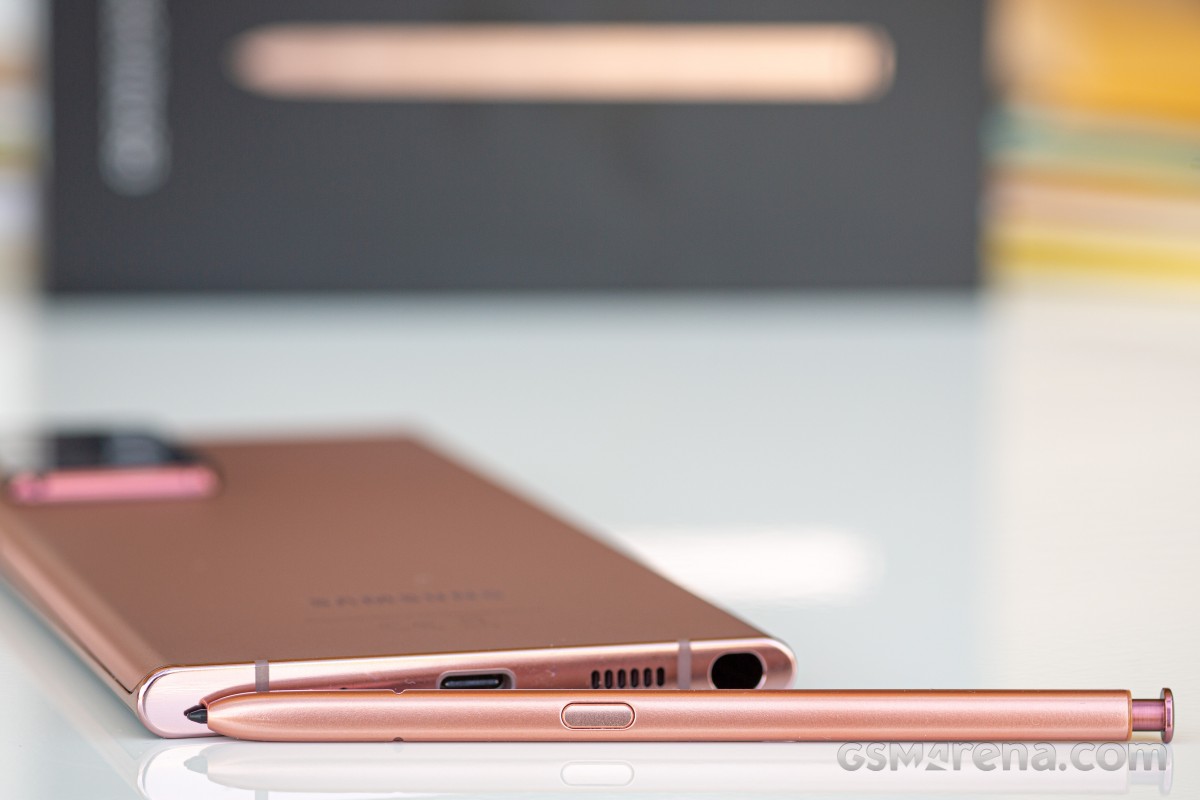
There are things that the Galaxy Note20 Ultra does very well. Its screen is, in terms of quality, the best of 2020, for example. The phone is also the best looking one ever made, in this reviewer's opinion, and it's not just pretty but the design is striking and instantly recognizable as both a Samsung phone but also a unique Samsung phone. Iconic, dare we say it. The feel of the satin-like finish on the back is exquisite too, and handling is very good for such a big phone, even if the corners do cut into your palm somewhat.
The cameras are top notch for sure, but we can't call them the absolute best, neither for stills nor for video. The iPhones take the cake for the latter, while for the former there are Android devices out there that do things better. If you're not a stickler for details, though, you're unlikely to care, and you may even prefer 'the Samsung look' to objectively better quality. The Note20 Ultra also has you covered with a great amount of versatility when it comes to framing thanks to its wide-ultrawide-periscope zoom arrangement on the back.
Performance is excellent despite the fact that our unit has the Exynos 990 chipset, which seems to be inferior to the Snapdragon 865 that models in other parts of the world got. Smoothness, once updated to One UI 3 with Android 11, is the best we've ever felt on a Samsung smartphone, and it's a very obvious improvement compared to the S20 Ultra on One UI 2.x (though we haven't retested that one with One UI 3 to compare head-to-head). Fingerprint unlocking speed has received a significant boost after the update too, so it turns out that ultrasonic sensors weren't inherently slower than optical ones, it was just the software holding things back.
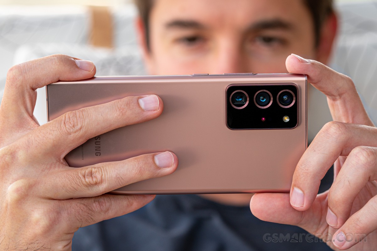
Battery life is very good, with the phone likely to last a full day for most people, if not those with very intensive use cases. The stereo speakers are among the best sounding we've ever heard, and probably the loudest, subjectively. It's a joy to consume content on this phone, whether that be listening to podcasts or watching videos. The vibration motor is excellent too, easily among the best we've ever felt, even though we think it could be put to more use throughout the UI. We haven't encountered any connectivity issues whatsoever, and that's also a huge plus because this is still not always a given for every device we have for a long-term review, unfortunately.
The S Pen is still unique in the mobile world, thanks to its many features and now record-breaking latency. It's a good experience to use it, from the standpoint of how much you can do with it, and how easy it is to use, but we'd wager that most people don't ever need a stylus on their smartphone. And it's not just us - had this been a make or break feature for many people, Samsung's leading flagship line in terms of sales would have been the Note family, but it's not. So while we usually praise Samsung for sticking with the S Pen, maybe it's time to wonder whether it doesn't make more sense to simply support it on S series flagships instead of creating an entirely different family just for this one added feature. Even Samsung seems to think so too, as the S21 Ultra now has S Pen support, even if the stylus isn't built-in.
Maybe that's the future. Remember when everyone bashed Sony for releasing two very similar flagship handsets every year a few years ago? Well, Samsung has been doing exactly that too, but it smartly markets them as two very different, very separate things. They aren't. Sure, the company is obviously employing two different design teams nowadays (just compare the Note20 Ultra to the S20 Ultra and you'll see what we mean), and we'd hate for one of them to be let go, but seriously - why does the Note line need to exist again?
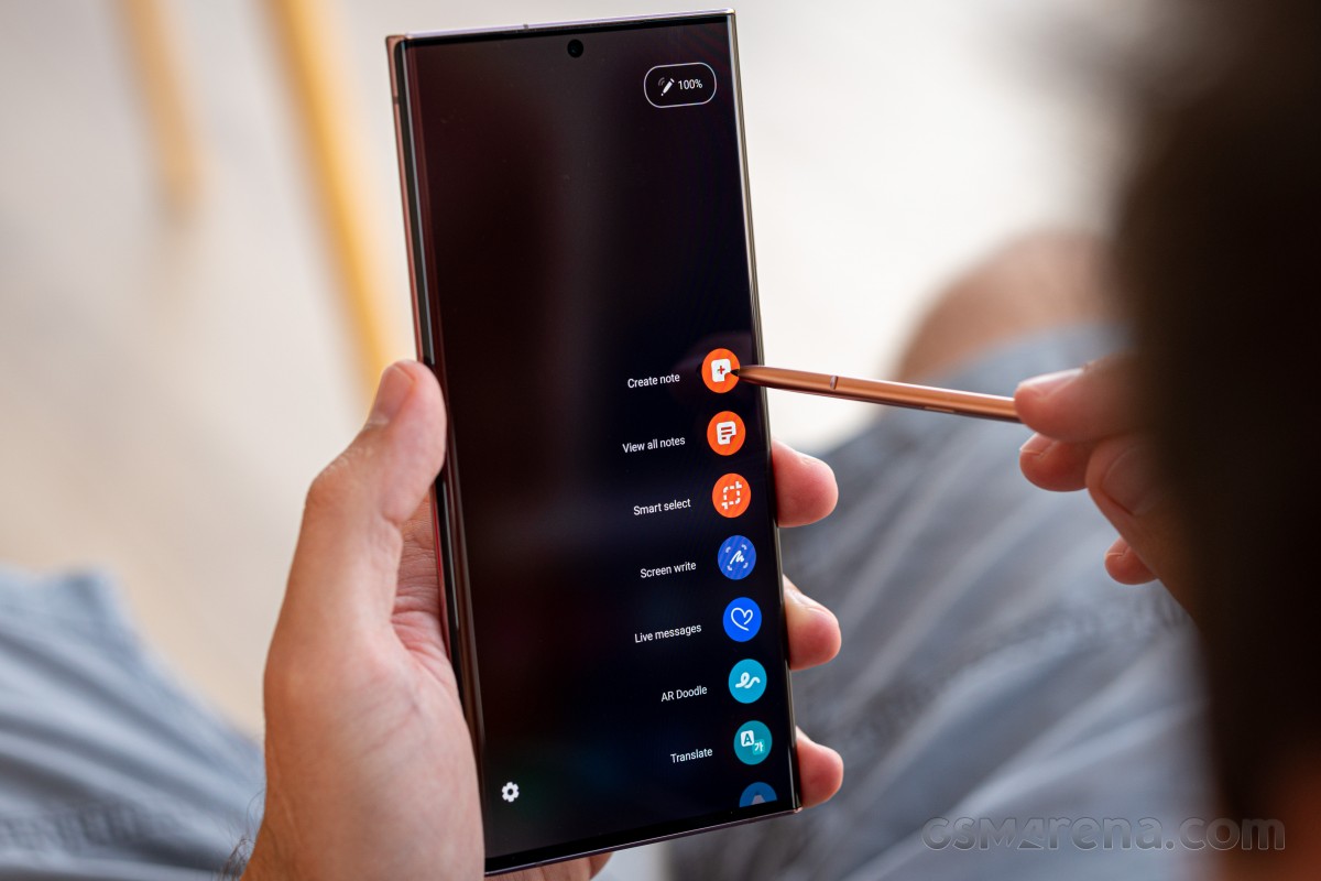
It started off by focusing on two things that other phones didn't have: a huge screen and a stylus. The former advantage is long gone, while the latter is probably nice to have for a very small minority of consumers. And those could very well be served by an S Ultra model plus a separate purchase of an S Pen with a special case to hold it. That's what's starting to happen with the S21 Ultra, although that S Pen doesn't have Bluetooth so it can't replicate all of the Note20's S Pen's features, but hopefully with the S22 Ultra that will change and Samsung's flagship lineup will be simplified. It's high time for that.
Quick rant aside, let's now turn to the Note20 Ultra's not so great aspects, because there are some of those too. The screen may be amazing in quality, but it can't do both maximum refresh rate and maximum resolution at the same time, you still have to give one up, which is ridiculous for such an expensive device in a world in which some of its competitors do pull off this seemingly impossible task without breaking a sweat.
Speaking of the display, accidental touches from holding it are much rarer than on any other Samsung with a curved screen, but they're still there, and this is quite hilarious to see when phones like the Huawei Mate 40 Pro, with a much curvier panel, suffer from zero such issues.
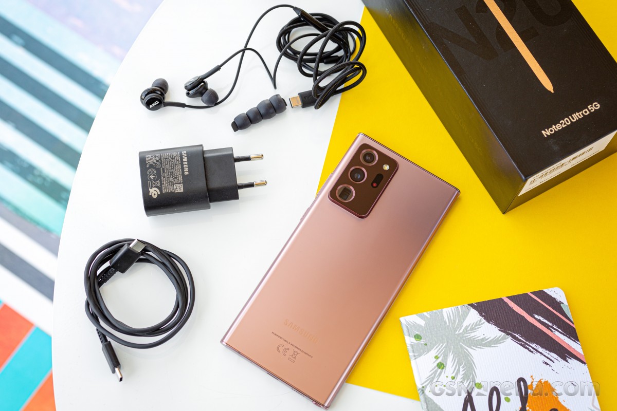
Battery life is good but it could have been better had the battery been larger - the S Pen literally, physically got in the way of that. This is the biggest cell ever put into a Note, but if we're assuming that professionals of all kinds are more likely to buy this phone for its stylus, then it's those people who most need great endurance, isn't it? So why not add a mm or so to the thickness and give them more longevity on a charge?
And speaking of charging, Samsung is really behind in the fast charging game, compared to everyone but Apple and Google. The Korean company may be fine with this, as it may just be thinking of those competitors, but there are a lot of Chinese smartphone makers who now have much faster wired charging systems, some of them so fast that battery anxiety simply isn't a thing anymore when you use those phones. Don't get us wrong, the Note20 Ultra charges from zero to a hundred in under 90 minutes, but when other phones do the same in under 45 minutes (or even under 30), this is just a bad image.
Smoothness may be the best on any Samsung ever, but it's still not on par with other flagship devices from Oppo, Huawei, and Xiaomi. And that's obviously not going to annoy you if you switch to the Note20 Ultra from another Samsung device, but if you've used the competition, you'll be disappointed. And at this price, you shouldn't be.
So finally, let's address the pricing. The Note20 Ultra is cheaper now than it was when it launched, thankfully, but it's still an expensive flagship device, and that means that our judgement of it can't not be informed by the price point. Let's put it this way - if this phone cost $700, then it would be incredibly easy to recommend to anyone, even people who don't care for the S Pen, because you can of course just ignore it.
But it doesn't cost $700, at the moment it's over $900 even on eBay (and around €1,000 in Europe). Prices do jump around a lot, though, so don't take this as gospel - use our pricing page in specs to learn the current amounts. At this level, some of its omissions become glaring. We just can't excuse the 'good, but not on par with the competition' smoothness and battery life and battery charging speed, nor the display forcing you to choose between 120 Hz and full resolution.
You might, however. If these things aren't the most important to you, then the Galaxy Note20 Ultra is an otherwise amazing device. And if you are part of the S Pen crew, then it's basically the only recent flagship device that warrants buying, since the vanilla Note20 has so many compromises that we're amazed it was even launched.






0 Response to "Samsung Galaxy Note20 Ultra long-term review"
Post a Comment