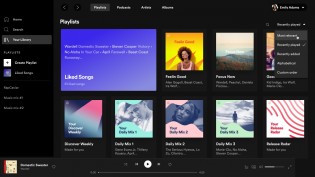
Spotify has announced it is updating the desktop app for desktop and web and is bringing a new “improved look and feel”. The redesign brings a lot of cosmetic tweaks, some features are finding a new place within the app, but the biggest noticeable change is the similarity to the mobile app.
The Swedish company has revealed the new update has been brought after months of debates and development. The Search field is no longer in the status bar - it has made its way on the side, right between Home and Your Library; this means Browse and Radio have been pushed into the three-dot menu in the upper-left corner.
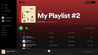
Adding tracks to playlists is also made easier - just a simple drag and drop of the track towards a user-created playlist does the magic.
Spotify redesigned features
One of the best features of Spotify Premium is the ability for users to download their playlists on mobile, and now they’ll be able to do this on desktop as well with the addition of a Download button/icon. There are also improved key combinations, which can be opened with Ctrl + ? or Command + ?, depending on the device.
The new redesign is already rolling out to all users globally, but it might take weeks to hit everyone. PC users can download the new app from Microsoft Store or Epic Games Store, while Mac users should head to Spotify’s website.
Related Posts :
 Deal: Become a machine learning specialist for just $34
- ArmadilloTek screen protectors won’t work with Galaxy S10 fingerprint scanner
- The first Android Q beta build leaks, reveals some of the upcoming features
- Forged Fantasy, the new action-RPG from Hothead Games, is out now on Android
- Apple loses appeal, $440M patent infringement fine stands
0 Response to "Spotify updates its desktop app to look more like the mobile version"
Post a Comment