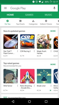
Google has been preparing the UI redesign of the Google Play app since the beginning of this year, but it's only now that the stable update has been rolled out to the wider public. It adopts a more simplistic approach with less clutter and more Material Design-ish look.
The first thing we've noticed is that the navigation drawer is now exclusive to apps and games while shortcuts to the media apps like Play Movies & TV and Play Music are moved in the hamburger menu right underneath Settings.
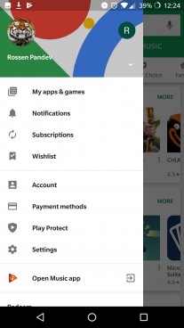
Some screenshots of the new UI
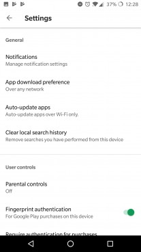
When you go deeper into the menus, you will immediately recognize the bright UI theme in line with the Material Design language, which Google has been pushing for years. The "My apps & games" and the "Settings" menus are now in white and gone is the green accent color. Unfortunately, the former menu is now missing the search option in the upper-right corner.
The Account menu also gets re-organized and now opts for tabs instead of a list. And strangely enough, the Wishlist menu is now grouped with Notifications and Subscriptions in the slide-out hamburger menu.
The new iteration is 12.6.13 and if you are still on the older version, try restarting the app. The update is server-side and it should appear sooner than later.


0 Response to "Google Play app gets revamped with new, simpler UI"
Post a Comment