Introduction
Over the past few years, Huawei has always impressed with its flagship smartphones, which have all had a very good balance of specs, raw performance, subjective smoothness, and amazing cameras. However, since mid-2019, the Chinese company has been hobbled by the US Government's various sanctions and bans, which have resulted in Huawei losing access to Google services and apps. This means it has had to go at it alone on the software front, and it all started with last year's Mate 30 series.
We've taken a look at what it was like to live with the Google-free Mate 30 Pro in 2019, and then we touched upon the improvements we saw in this regard in our P40 Pro long-term review earlier this year.
Now that 2020 is almost ready to come to a close, we were wondering what (if anything) has changed over the past few months, and just how easy it is to get along with Huawei's Mobile Services instead of Google's, on an Android flagship smartphone.
We were lucky enough to have a Mate 40 Pro around, and thus decided to see what it's all about. This is not one of our normal reviews that focus on objectively measuring every aspect of the phone's performance.
We'll let you know what it's like to live with the Mate 40 Pro day in and day out, where it amazed us and where it disappointed, but we'll also focus a lot on the app situation and how you can get around that without resorting to installing Google Mobile Services from shady sources across the Internet. Sure, you theoretically also have that option if you buy a new Huawei smartphone, but we can't condone or recommend it, because random weird unheard of Chinese apps are still required, and who can tell how safe it is to put your digital life in their hands? Additionally, last we checked, notifications still won't work for Google apps, which for most people would render them quite useless.
So this is an experiment meant to let you know how things stand in late 2020 when it comes to using either Google apps or alternatives, on a top of the line Huawei device. But it's also going to give you a more subjective picture of what the phone is actually like outside of lab testing and the likes. If you're ready for the journey, make sure you join us over the next pages to find out if the Mate 40 Pro can really compete with other, similarly priced Android flagships that come with Google services.
HMS, not GMS
Let's start by addressing the huge elephant in the room, and that is the Mate 40 Pro's software, and most specifically, the lack of Google services and apps on board. It's been more than a year since Huawei first had to grapple with this politically-lead situation, and we were very curious to see where things stand from this point of view in late 2020.
Huawei has had more than a year now to develop its alternative to Google Mobile Services (GMS), called Huawei Mobile Services (HMS). We've previously touched upon what it was like to live a GMS-free life with the Mate 30 Pro last year, and then once again in our long-term review of the P40 Pro earlier this year.
This time around, we were thrilled to see that things have, in fact, changed for the better in the past few months, and Huawei isn't standing still in trying to make the situation more palatable for its customers. Right now, the Mate 40 Pro is very usable for the basics, with no huge issues. However, there's still the fact that you're losing access to Google Assistant if you go the Huawei route. Celia is a good effort, but it's nowhere near close to Google's competitor. Celia is also not available in most markets, and for most languages, so there's that too. Basically, you should expect an assistant-free life, unless you want to install Alexa and use that through its app.
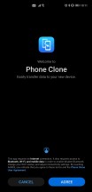
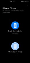
One important point before we move on: you can transfer over apps from your previous Android phone during the initial setup of the Mate 40 Pro (and any other Google-free Huawei device), or later using Huawei's Phone Clone built into Settings. This will not carry everything over, especially not Google apps, but many apps do make the jump. The apps you have transferred in this way will then be theoretically updatable by using one of the app stores we discuss in the following section below.
However, you may find that not all transferred apps actually work with HMS, even though, in our case, most of them did. If you have an app that simply refuses to work, you can try using its corresponding mobile website/web app version. If that fails, then you're unfortunately out of luck. Also, restoring purchases made through the Play Store is unsurprisingly not possible. Any paid apps you might have or any subscriptions - they won't carry over your Huawei phone unless the app developer has a procedure for that in place.
Huawei App Gallery and alternative app stores
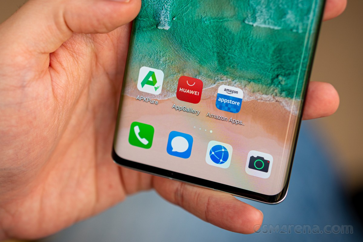
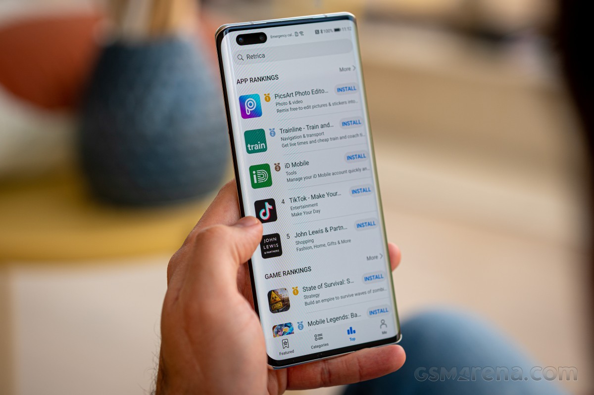
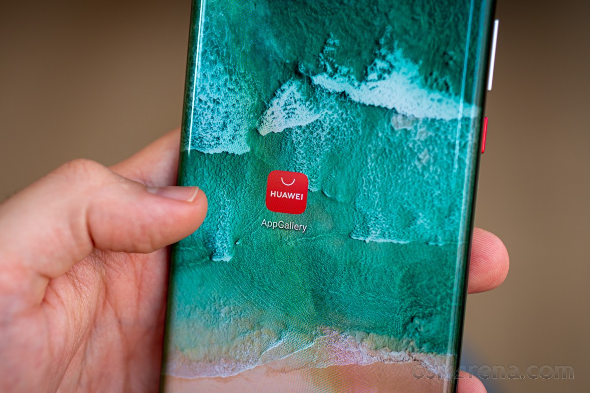
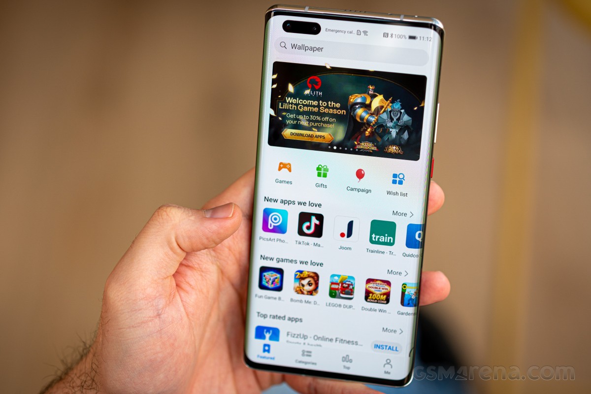
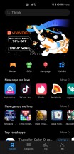
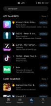
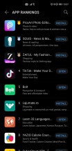
Huawei's App Gallery, the company's very own app store, is more stocked than ever, but that doesn't mean you should expect to find every single app that's also in the Play Store - not even close. The number of apps in the App Gallery has kept growing, and that's good to see, but there's still plenty of room for improvement. Thankfully though, this is Android, and you can also use alternative app stores to download those apps that you just can't find in the App Gallery.
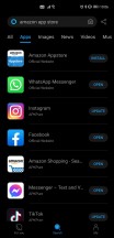
Amazon's Appstore is an obvious option here, and actually the only other one that allows access to paid apps. So from that point of view, it may be essential for you, despite its archaic design. Not only does it work, though, but it also has all of the Facebook apps, for example. That said, you won't find anything that directly competes with Amazon's services in there, so no Netflix or Spotify. The Amazon Appstore has an additional issue, and that is that some third-party apps simply haven't been updated in a long time, so what you're getting may not be the latest iteration as available in the Play Store.
For this reason, we decided mostly to stick with the App Gallery, as well as APKPure (unless we really needed a paid app or game that wasn't available in App Gallery). APKPure is another app store out there and, unlike the other two, is taken care of by enthusiasts, yet it doesn't have any paid apps. For the free stuff, though, it's very good, as basically you can find every app that isn't in the App Gallery. An important thing to remember is that APKPure is meant for all Android phones, so the mere fact that an app is listed there is no guarantee it will actually work on the Mate 40 Pro. You'll find that out once you've installed it.
Huawei's Petal Search is a very efficient way to find where you can download the apps you are after, sidestepping the need to perform a search in three different app stores. And yet, although it does sometimes link to things in APKPure, it also has the tendency to take you to other APK repository websites through the browser, where you manually download an APK.
That's fine, but 99% of the time, you would find the same app in APKPure, so if you already have that store installed, it would be less of a hassle to just get said app from there. Things can definitely be improved with Petal Search, but it's the best metasearch engine for apps out there, even as it is. It's made very easy to use because it has a search widget on your default home screen when you first set up the phone, but you can also just launch the Petal Search app, of course, to achieve the same purpose.
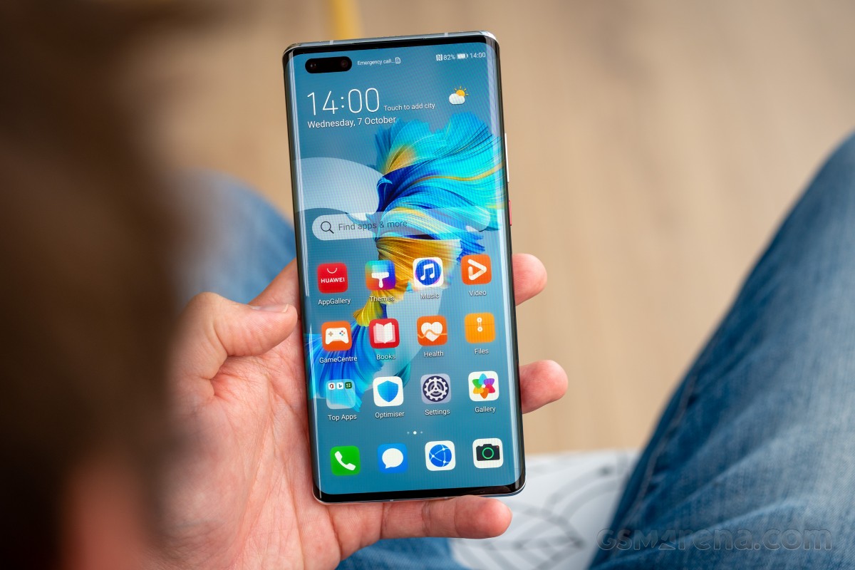
Perhaps its most useful aspect is that it gives you suggestions about using mobile versions of certain apps - either normal ones or progressive web apps. If you go this route, you'll get a shortcut on your home screen, and so from the point of view of access, it's almost like you actually have the app installed. It will do this for apps that are known not to work on Huawei phones even if you manage to install them from a third-party source. This comes in handy for things like Uber, which starts but can't do any mapping, for example, because it uses GMS to get and show the map. But you can use the Uber mobile website through a "quick" app. The same goes for Uber Eats.
We're now going to list a bunch of apps, going by rough categories, that we tried and are working, along with where to get them, so you can get a better feel for what's what.
Social networks and messaging
Petal Search will give you links to download Facebook, Messenger, and WhatsApp from their respective websites, but you can also find all of these in both Amazon Appstore and APKPure. The same goes for Instagram, where Petal Search only links you to the mobile version.
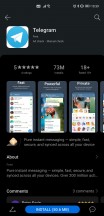
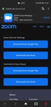
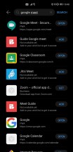
You can find Telegram, Snapchat, TikTok, WeChat, and Viber in the App Gallery. Skype can be downloaded from APKPure, and the same is true for Zoom (Petal Search takes you to the official website for the download). Google Meet is offered in App Gallery and Petal Search as a progressive web app, while Twitter is just a link to the mobile website, but the app from APKPure works flawlessly. Finally, if you're into Pinterest, you can get it as a quick app from App Gallery or Petal Search.
The Gmail app doesn't work, but the built-in client does the job just fine for Gmail accounts and countless others, although it comes with a very ancient-looking design and is rather barebones. If you want something more modern, grab Outlook from APKPure as we did. It works great and will almost make you forget about the Gmail app. If you just can't live without Gmail itself, the mobile website is your friend, although it's much less functional and polished than the app.

Built-in email client works with Gmail accounts
Browsers
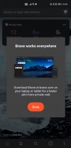
The built-in browser is perfectly good enough for most people, but if you need something else, you can actually use Chrome, believe it or not, only you won't be able to sign in for sync. You can get it from APKPure. Alternatives that work include Opera, Opera Mini, and Vivaldi - all of which are available in the App Gallery, and Brave from APKPure.
Maps
Maps is actually one of the most developed categories, so you're pretty much covered no matter what. Even Google Maps works perfectly (after you download it from APKPure), with one niggle: you can't sign in. If you need to sign in, the mobile website will do that for you, but it's slower and clunkier. Waze works 100%, though (from APKPure).
Alternatives start with Huawei's own and very new Petal Maps, which seems good and has a Dark mode that syncs to your phone's. It feels decent for the basics, but understandably its database of points of interest is severely lacking compared to Google's.
In the App Gallery, you can also find TomTom Go, an app with a rather old school approach involving downloading maps for the areas you're interested in before you can use it. It will obviously do navigation, but it's just a free trial at first, and then you need to pay around 2 euro per month, or 10 per six months (at least in our region, these prices may be very different elsewhere).
Here, WeGo is also in the App Gallery, as are Sygic, Maps.me, and Moovit (the latter being our favorite for public transportation).
Entertainment
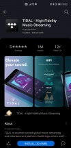
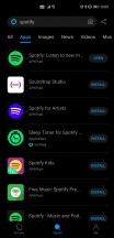
You can get Deezer and Tidal from the App Gallery, as well as MusixMatch for lyrics and song recognition. Other apps that work are Spotify, Netflix, HBO GO, Shazam, 9gag (all from APKPure), Prime Video, and Amazon Music (from Amazon Appstore or APKPure).
Office
Microsoft Office is available in the App Gallery and works perfectly. If you want alternatives, Huawei's app store also houses MobiSystems OfficeSuite and WPS Office. Adobe Acrobat works as well (from APKPure), as do OneDrive and Dropbox (from Amazon Appstore or APKPure).

Microsoft Office in App Gallery
Other apps
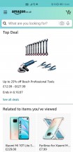
The App Gallery has TrueCaller, Bolt, Foodpanda, and any.do. LastPass, Medium, Pocket, GSMArena, and Mi Home all work from APKPure. Todoist and Feedly work (from APKPure), but only if you don't try to sign in with your Google account (understandably). Thankfully both of those have alternative sign-in options that you can turn on from their respective websites. Glovo doesn't work at all, while the Amazon Shopping app does and can be downloaded from both the Amazon Appstore and APKPure.
Other Google apps and alternatives
Drive is the main no go, the app doesn't work at all, and the mobile website doesn't let you upload anything - but you can still view and download your stuff. You can try to sidestep the upload limitation by requesting the desktop website in your browser, but that's notoriously one of the heaviest pages on the Internet to load, so the experience may not be good at all.
The Google Keep app doesn't work, but you can use the mobile website. It's less responsive and looks slightly worse, but gets the job done. If you search for it in Petal Search or App Gallery, you'll also get the option for a progressive web app version to add to your home screen, which is the best scenario to go with here.
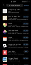
Google Keep is suggested as a PWA
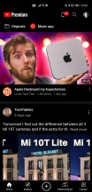
The YouTube app doesn't work, but you can use the mobile website, of course. If you really want an app for your YouTube needs, get Vanced - although the installation is complicated and not for the most casual of users, once you're done with that, you'll end up with what is basically a slightly improved version of Google's YouTube app - including support for accounts. Kudos to the team of enthusiasts developing this. A YouTube Music version was also in development last time we checked. In the past, we also tried NewPipe, but not this time around since we liked Vanced so much.
Play Books is simply a no go period, the app doesn't work, and there's no online mobile web version, so you're just out of luck. That said, Kindle (from Amazon Appstore or APKPure) works perfectly for your eBook needs.
The Wear OS app doesn't work, and there are no workarounds that we could find either. This means you can't use a Wear OS watch with a Google-free Huawei smartphone at all. On the other hand, Samsung smartwatches should work; you just need to get the Galaxy Wearable app from APKPure. Garmin Connect isn't on any of the three app stores we were using, but you can find it online in other APK repositories, and once installed, it works flawlessly for Garmin smartwatches.
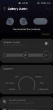
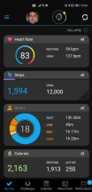
Galaxy Wearable and Garmin Connect
Google Photos works but just as what is basically an offline gallery app, and that makes it quite useless when the Mate 40 Pro already has a Gallery app installed. This works well and will backup your photos and videos to the Huawei Cloud. Then you can access them from other Huawei devices as well as through a website on any browser. The only issue is that, like Apple, Huawei only offers 5GB of space for free - and this is shared among photo and video storage, phone backups, and your cloud drive should you use that too. This means you'll run out of space very quickly, and then it's time to pay Huawei for more GBs. The prices are fair and slightly lower than the competition, but we would have still liked Huawei to throw in at least 50GB as a gesture of goodwill towards people spending so much on a device devoid of any Google services.
Banking
The Financial app category is probably the one that is most dependent on your region, so all we can tell you is that most of our local banking apps work now, which is a considerable improvement compared to just a few months ago. Hopefully, the situation is similar where you live. Still, if you're thinking of getting a Mate 40 Pro or other Huawei device sans Google, perhaps it's best to download App Gallery onto your existing Android handset (yes, you can do that) and check for your banking apps of choice. For what it's worth, we found that Revolut works, but it's not in the App Gallery, so you'll have to grab it from APKPure.
TL;DR
On the app front, things are much improved from a year ago, and even from earlier this year. That said, the situation is still not smooth sailing at all; you need to use at least two different app stores (perhaps even three), and while Petal Search is good at telling you what is where this still adds friction that's simply not there on any Android device that does have Google services. On top of that, some apps simply don't work at all. Still, the number of these has gone down significantly, and even for those that refuse to function properly, there are usually workarounds if you don't mind using a mobile website, for example.
So, to sum up, while things are still not as good, from the point of view of app availability and functionality, as they are on any phone that has GMS, they're definitely much better than they used to be, and unless you're really inflexible about which specific app you use for a given purpose, you'll probably find very good alternatives even for those that don't work. An exception here is Google Assistant because neither Alexa nor Celia comes anywhere close to its smarts, unfortunately. And if you have a Wear OS watch and want to keep using it, that's not going to happen if you have an HMS device like the Mate 40 Pro.
EMUI 11 is still Android 10
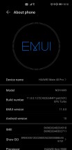
The Mate 40 Pro runs EMUI 11, and with that number, you might expect it to be based on Android 11, but no - it's still Android 10 under the hood. That's weird, and we're assuming it's connected to one of the multiple bans from the US Government. This, however, raises more than one question - we're not sure if the Mate 40 Pro will ever be updated past Android 10.
Huawei seems more focused on its upcoming Harmony OS at this point, so it hasn't said anything about underlying Android version updates. A good rule of thumb would be, in our view, not to expect anything but EMUI updates, and then, perhaps, at some point in the future, an update that will replace Android and EMUI with Harmony OS. At least that's what the rumors seem to think will happen, but we'll cross that bridge once we get to it.
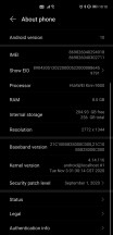
On the security patch front, things aren't as good as we would have hoped. We have received one minor update during our month with the phone. Still, even after that, our review unit was stuck on the September security patch level, which is unacceptable for a flagship smartphone. We wouldn't expect the timeliness of these updates to improve in the future, either.
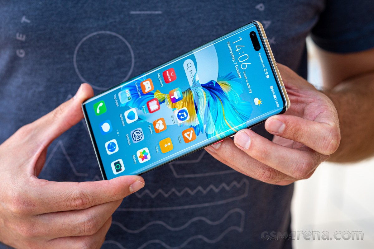
EMUI 11 is a very evolutionary update, and as such, it's incredibly similar in looks and functionality to its predecessor, EMUI 10. If you've used EMUI 10 before, you'll feel right at home, but you will also find some neat additions here and there, and some improved design too, but nothing too revolutionary. We can't object to this, as EMUI was already one of the best Android skins out there even before version 11 regarding what it delivers and how speedy it feels in operation.
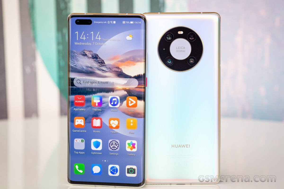
One of our pet peeves with EMUI 10 that hasn't changed one bit in EMUI 11 is the icons' placement in the status bar up top. Huawei likes to do its own thing here, giving us a setup that's unlike anything else in the Android world, with the Wi-Fi, mobile connectivity bars, and VoLTE/VoWiFi indicators all residing in the leftmost side of the usable space, while the clock, battery icon, Bluetooth, vibration, and alarm icons are at the opposite end. Because of the big pill-shaped cutout for the camera and face unlock sensor, the icons on the 'left' end up being almost centered on top of the screen, with notification icons showing up to their right.

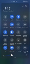
EMUI 11 design, weirdly placed icons
The combination of the big notch and the placement of these connectivity icons makes for unintuitive placement of the notification icons. It's not a huge usability issue, but nonetheless, we can't figure out why Huawei decided to organize its icons this way.
Launcher
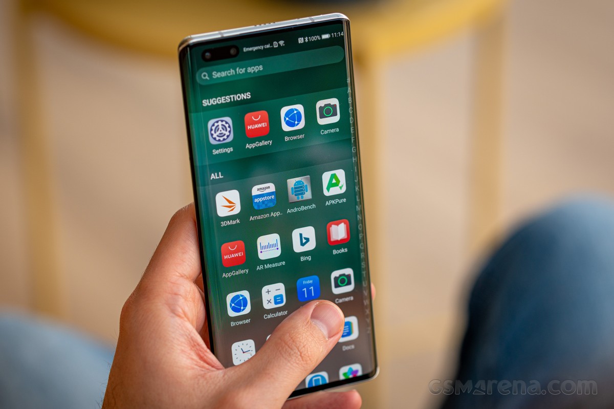
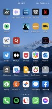
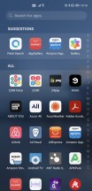
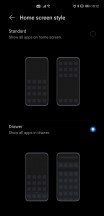
The built-in launcher has an app drawer, thankfully, and there's not really much more we can say about it. It's there, it works, and is a godsend for people like us who have 200+ apps that would otherwise clutter up home screens left and right.
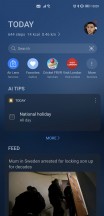
The launcher also has the Today screen to the left of the leftmost home screen, and it's apparent that it wants to present itself as an alternative to Google's Feed, but what it shows seems to be a more or less random collection of news items. Google definitely has the upper hand when it comes to the personalization of what you're being shown. On the other hand, Huawei's Today view is infinitely scrolling, and the transition to it from the leftmost home screen (and back) is by far the smoothest we've seen so far on any phone that has such a panel/view/screen.
The main issue we've had with the launcher is that there's still no setting to make a swipe down from anywhere show your notifications pane. So when you perform that gesture, as we did after having been used to it from basically every other Android phone out there, you're sent to a search screen, which is just Petal Search in disguise. We'd much rather have a choice here, but we don't, and that means that you always have to reach the top of the screen to pull down the notifications shade, which considering how big the Mate 40 Pro is, isn't always doable without some awkward finger/hand placement gymnastics.
Settings, Dark mode, gestures, Recent apps
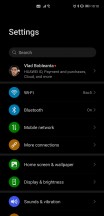
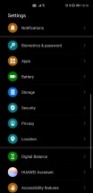
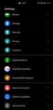
By now, you're probably used to Android phones having ample, convoluted Settings menus, and the Mate 40 Pro is no different. The top-level section isn't overly long, but there are, of course, submenus within submenus to discover. It's not the worst offender from the organizational structure point of view, either. In fact, it's probably one of the more logically organized we've seen recently.
The good thing is that most settings are easy to live with in their default states, so you don't necessarily have to dive into the menu countless times unless you want specific things to behave in a very specific fashion. Even then, you can use the very good search bar up top to quickly jump to where you need to go.
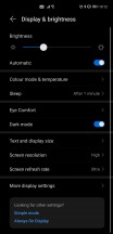
There's a Dark mode too, of course, and it works well while being very pleasant looking, with ample use of real blacks and not very many dark gray gradients. It works well; by this point, dark themes are fully a solved problem in the Android world, thankfully.
The gesture navigation is excellent, easily among the best implementations out there. As usual, you swipe from the left and right edges to go back, from the bottom to go home, and from the bottom and hold to open the Recent apps menu. All of this works very well all the time, but you can additionally enable a setting that lets you easily switch between apps by swiping across the bottom of the screen, even with no white line monstrosity being visible there (the way Google would like it).
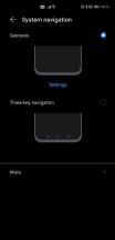
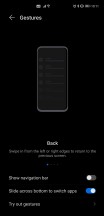
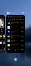
Gesture navigation, Recent Apps screen
This ability to quickly move through apps with a left or right swipe across the bottom of the screen is very well done and has been one of the most pleasurable aspects of using EMUI 11 on the Mate 40 Pro for us.
Design, build quality, handling
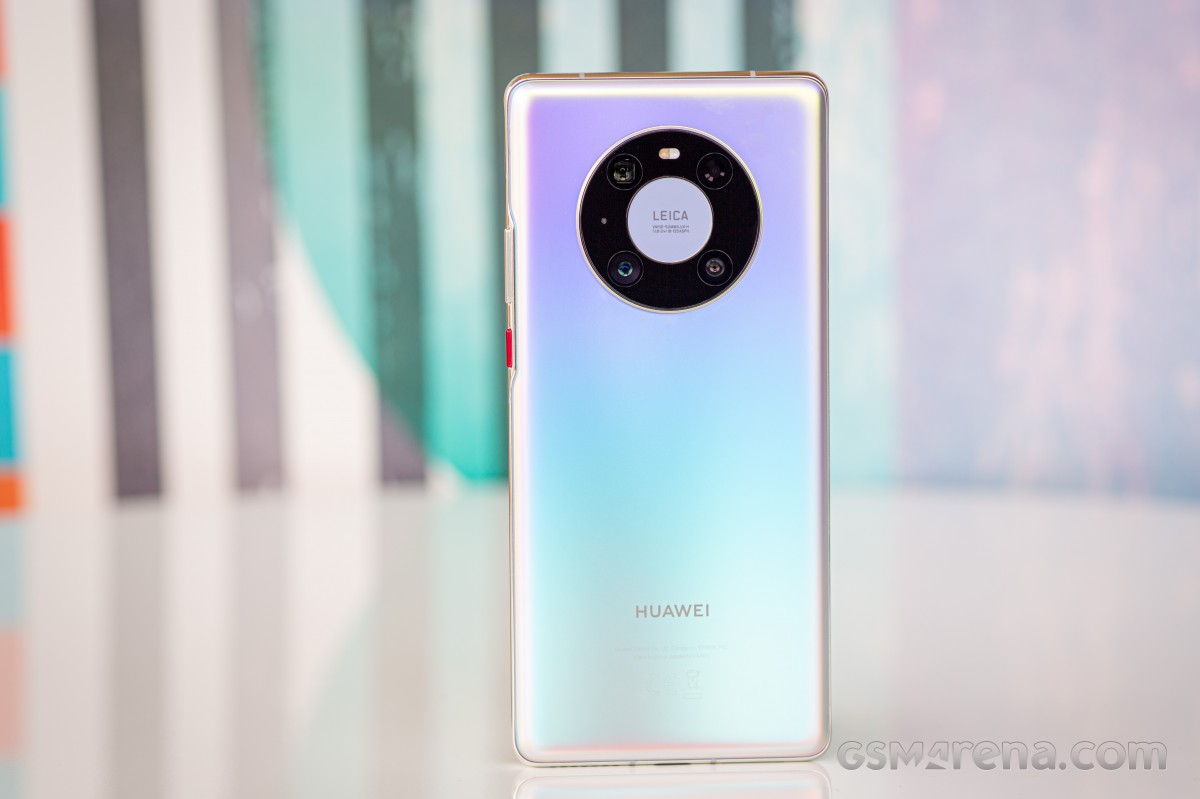
In a sea of very similar-looking glass sandwich construction smartphones, the Mate 40 Pro still manages to stand out so much that it's striking. That's down to a few of its particulars - the curvature of the screen and its effect on the frame and the buttons, the pill-shaped cutout for the selfie cameras, the round ring-like camera island on the back, as well as the rear glass finish itself and the way it feels in the hand.
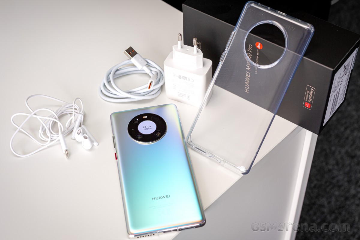
It's definitely no small feat to accomplish this, as this reviewer sort of thought he'd seen it all when it comes to glass sandwich devices, but no. The Mate 40 Pro goes its own way in a lot of regards, and while some of that could be controversial (or not useful) to some (see the Software section), in terms of design it's definitely easily recognizable as both a recent Huawei flagship as well as a thing onto its own.
There's no need to mince words when it comes to build quality and overall feel in hand. This phone is premium through and through. The curvature of the screen is very striking, as is the positioning of the power and volume buttons, which is caused by that - they're way towards the back of the handset, but at least this time around we get actual buttons, so Huawei rectified one of the main complaints people had with the design of the Mate 30 Pro. For the same screen-related reason, the metal frame itself is incredibly tiny, but still lends a feeling of sturdiness to the phone.
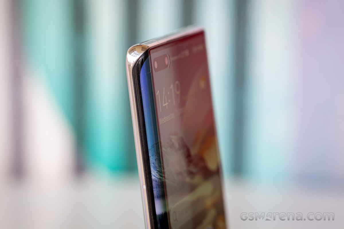
The pill-shaped hole-punch cutout for the selfie camera and face unlock sensor is big and definitely one of the least pleasing aspects of the phone's design, even if it does contribute to it being more recognizable on the street and in someone else's hands. It's an eyesore, but one that at least gives you more framing options than usual for selfies, as well as the most secure face unlock in the Android world (see the Biometrics section for more on this). The pill is technically not a notch as it's not centered, but it's also not very close to the left edge (because of the screen curvature), so it just sits there, awkwardly, in a puddle of asymmetry. You can of course 'hide' it in software, but then you basically engineer a huge black bezel at the top of your usable screen space, which feels like going two steps back instead of one.
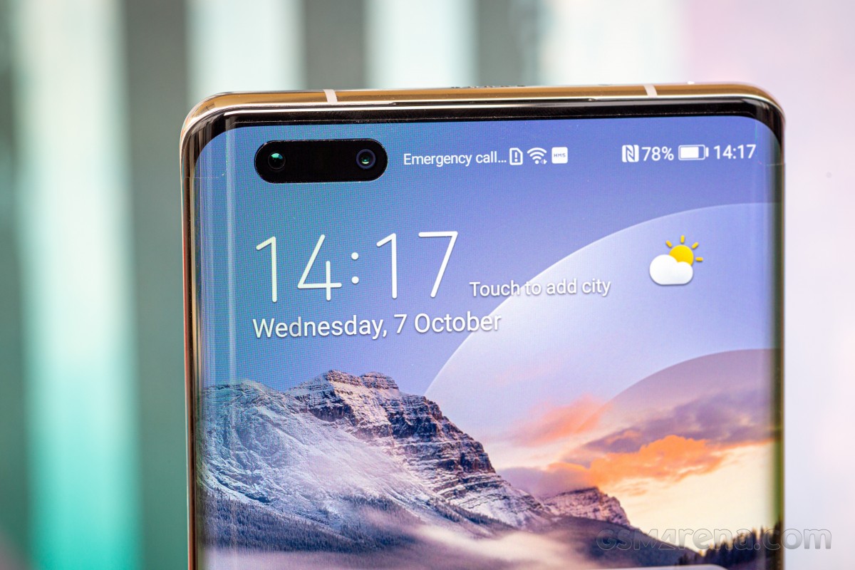
The screen's top and bottom bezels, on the other hand, are almost symmetrical, which is definitely a rare sight to see. They're not, but they're close enough that you won't be able to tell unless you actually measure them. The side bezels are weirdly also almost symmetrical to the top and bottom ones, which is another thing we aren't used to - side bezels are generally slimmer in flagships, but that's not the case here. This is another thing you're not likely to notice unless you really want to, and that's because the curvature of the display hides the size of the side bezels really well. When you're looking at the screen head-on, you don't see any bezels at all on the left and right.
The Mate 40 Pro is big and it's heavy and that also contributes to the premium feel, although it may be slightly too much for some people, especially those with smaller hands. The size was fine for this reviewer, but the weight is at the limit of what feels tolerable if you're going to use the device for more than a few minutes at a time. Handling is great, though, in part because there are zero accidental touches registered on the curved side of the screen, so you can get a very comfortable grip.
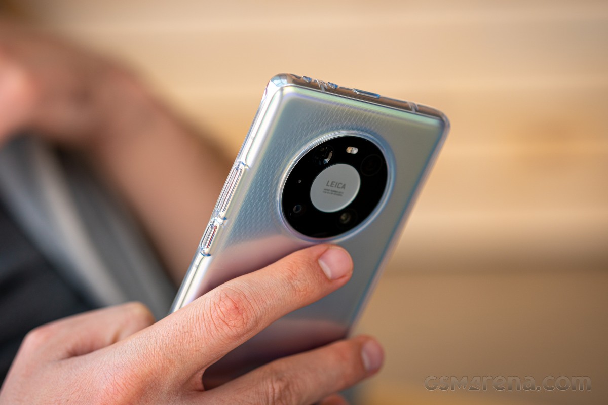
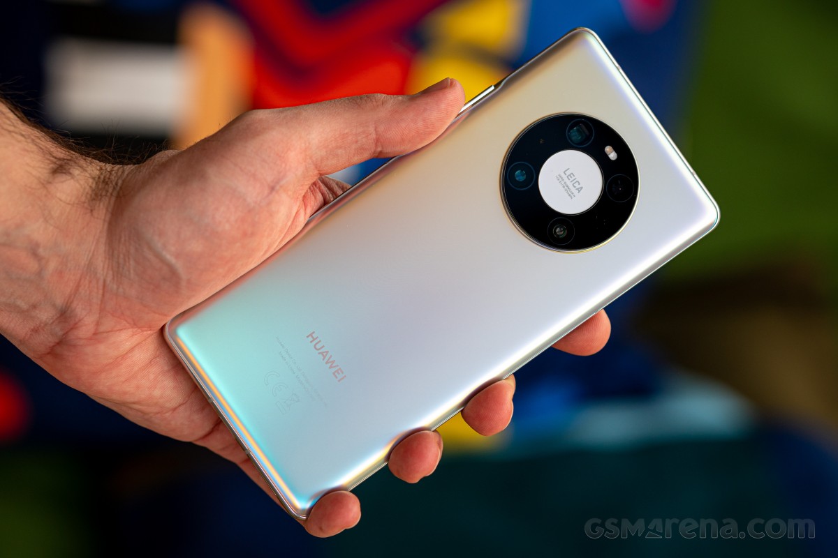
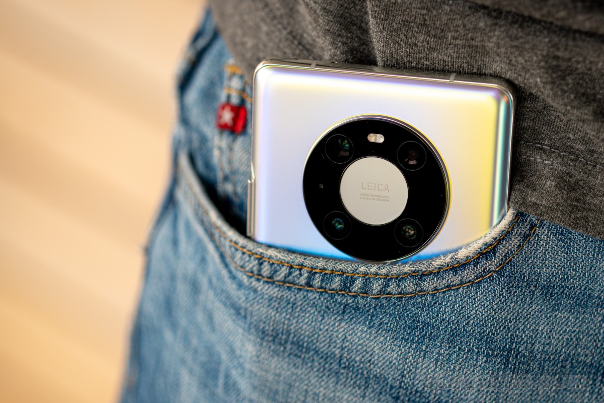
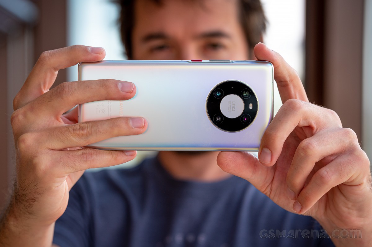
The back has, dare we say it, the best looking camera island we've ever seen, with the ring-like design taking things in a much better and less tacky looking direction compared to the Mate 30 Pro. Sure, if you turn it upside down it might sort of look like an iPod, but that point is moot. Good design is good design, no matter what. As the ring is centered horizontally, there's symmetry too, which is enhanced by the positioning of the sensors inside the ring. Because the ring is so huge, there's no wobbling if you type while the phone rests on a desk, but because the ring is so bulging there will be much wobble if you try to hit the upper left or right parts of the screen.
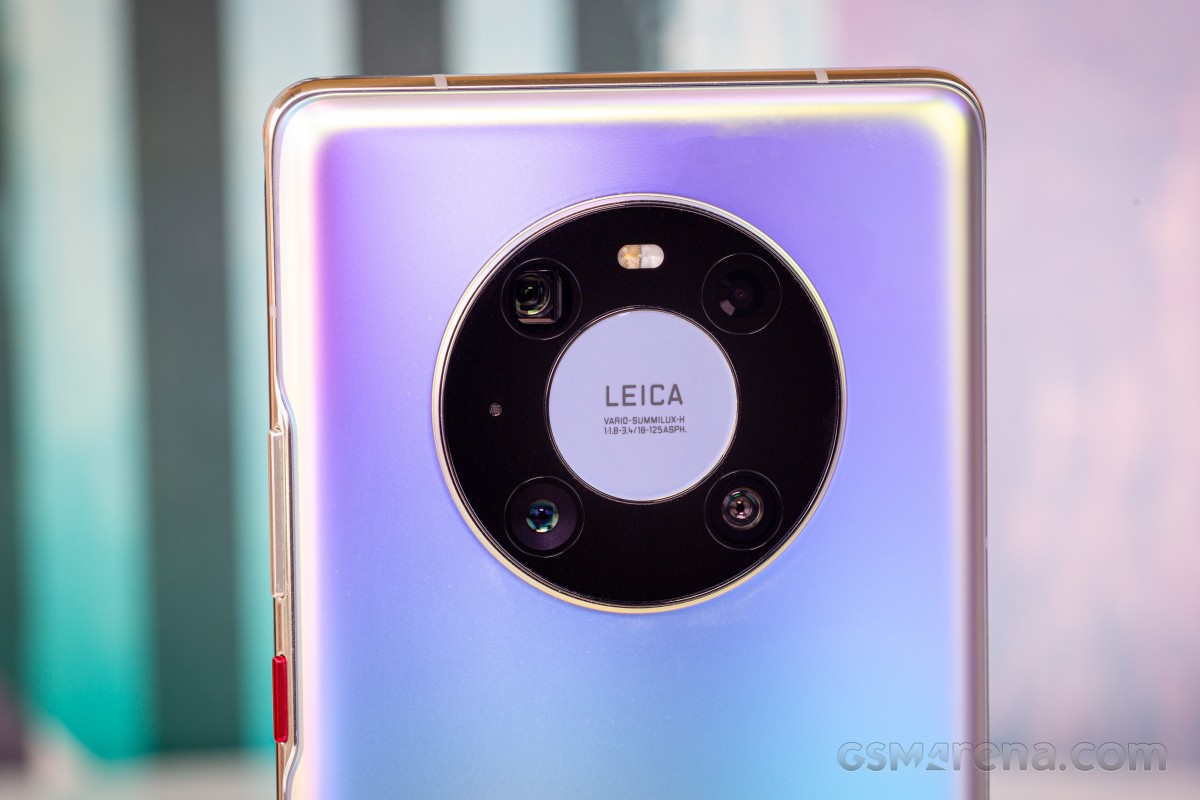
The bottom part of the ring is very useful to rest your finger against when you hold the phone, and this is amusingly made easier by how thick the bulge is. The back of our silver review unit feels like metal, which is no small thing to pull off considering the material in use is still glass. It doesn't show many fingerprints and while slippery, we've definitely seen worse with some matte finishes out there.
The back also looks the part with Huawei's interpretation of the "all the colors" mantra at work here based on the various light reflections. These give you a ton of different shades, but you still have an overall color to look at most of the time, in contrast to what Samsung had done for its Galaxy Note10 family. We'd say this design looks more mature and less flashy, while being almost equally appealing. That is, of course, unless you throw a case on the phone, then missing a lot of what makes it special.
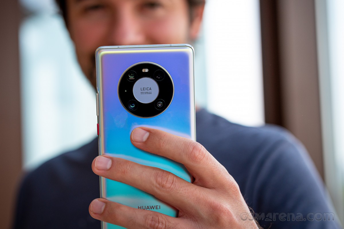
But that's a normal aspect of life for most people given how brittle glass is, and Huawei helpfully provides a simple jelly case in the box. This is definitely a case, but it's flimsier than in-box cases for much cheaper devices provided by some of the company's Chinese competitors, so while it's a good gesture it could have been harder and more protective. The screen edges are understandably not protected at all, which means if you're unlucky enough to drop the Mate 40 Pro, you need to hope that the front glass is sturdy enough to take that impact without shattering.
Overall, the Mate 40 Pro looks and feels incredibly premium, as it should, given its price point. From the design, build quality, materials and construction points of view it's definitely where it needs to be to even begin to justify its asking price. There aren't any competitors out there that are better built, and when it comes to handling it's among the best big phones, if you don't mind the weight and heftiness.
Speakers, buttons, vibration motor
The Mate 40 Pro has two stereo speakers, and their output is great. They get loud and are very high quality considering the small space they have to work with inside a smartphone. We'd definitely say these are among the Top 4 best speakers on a smartphone right now, alongside those seen in the Xiaomi Mi 10 Pro, Oppo Find X2 Pro, and Samsung Galaxy Note20 Ultra. Which exact pair is the most satisfying for you will be a matter of personal preference, the point is you can't go wrong with any one of these.
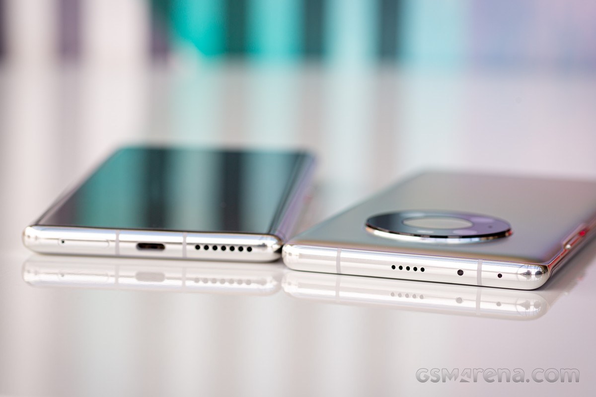
In this reviewer's subjective opinion, the Mate 40 Pro's speakers are very slightly behind the Find X2 Pro's and Mi 10 Pro's in clarity and the Note20 Ultra's in top volume. But again, the deltas are small and the quality you're getting is top notch. It's amazing to see how far we've come in this regard with flagships in 2020 making any memories of cupping a phone with your palm to hear what's played just distant nightmares from a weird past.
The Mate 40 Pro has actual physical power and volume buttons, unlike its predecessor, and they're very welcome to have, but will take some getting used to because of how close they are to the back of the phone. This is inevitable on the account of the screen's curves, but it's still a point to note.
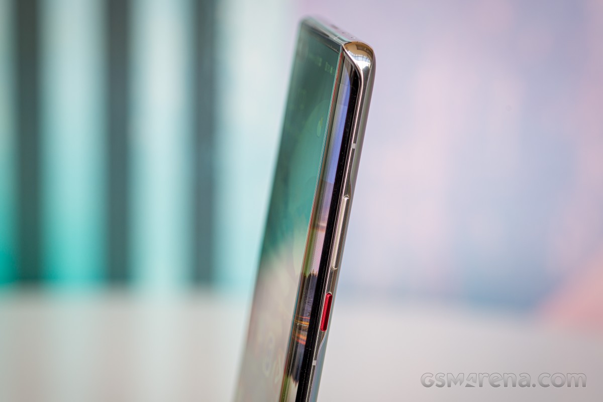
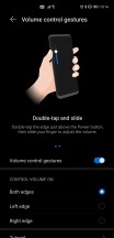
The buttons themselves are metal, and very nice feeling to use, despite the fact that they're incredibly narrow. We got used to them in a couple of days and never looked back. You do also have an alternative way to change volume, by double tapping either curve of the screen in the top side - you then get a software slider that you can swipe up or down. This works too, and much better than we expected by the description, but the reality is our fingers have so much muscle memory from always having used hardware buttons for this purpose that we ended up doing that most of the time.
There's not a lot we can say about the Mate 40 Pro's vibration motor, other than it's one of the best around in any smartphone right now. Again, which is the perfect one for you is a matter of personal preference, but this is up there with the best of them, easily Top 5 (if not Top 3).
If you ask us, the Mi 10 Pro's still takes the cake, but that may be down to how MIUI 12 intelligently uses gentle vibrations throughout the UI more than the actual quality of the hardware itself. Rest assured, you won't be disappointed on this front if you pick the Mate 40 Pro. That said, after having used MIUI 12 a lot this year, we have become sort of spoiled and wish more companies would get inspired by what Xiaomi has done and use gentle nudge-like vibrations as a way to enhance the user experience by making touches and scrolls feel more physical.
Display curves, refresh rate
We'll first talk about the two elephants in the room (so many of those when it comes to the Mate 40 Pro). Yes, this is one of the most curved screens on any smartphone ever. But no, you will never have any issues with accidental touches. Seriously, we don't mean "this is a problem, but not a huge one". We had zero such issues in our month with the phone. Zero. Someone should probably tell Samsung (and people who have only used Samsung phones with curved screens) that this is, in fact, possible, and doesn't break the laws of physics or anything. All we can say here is kudos to Huawei for figuring out the perfect hardware/software blend to make this 100% a non-issue.
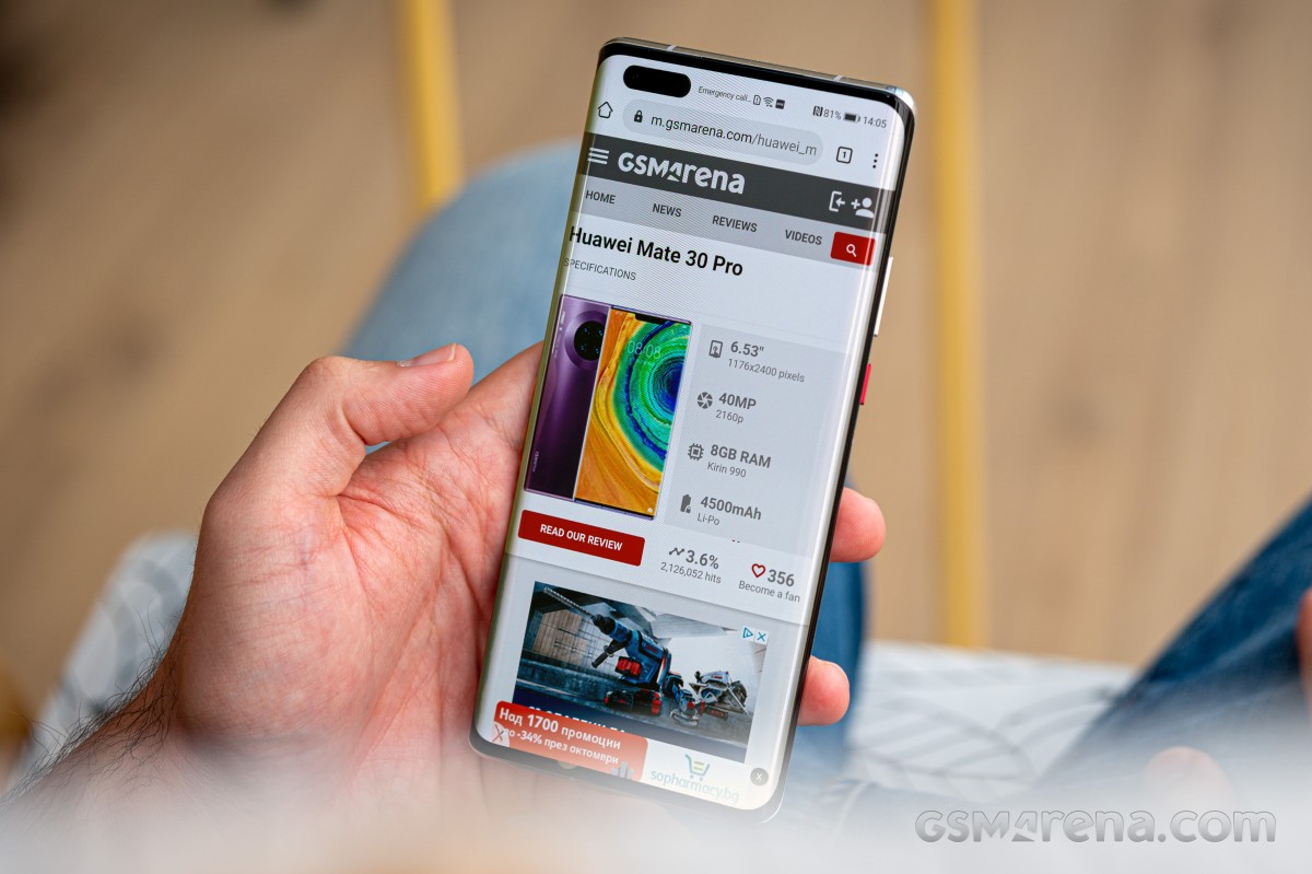
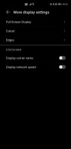
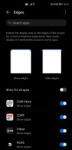
And yet. If somehow you find yourself having a different experience, you can "hide edges" for specific apps - this will prevent them from drawing over the edges of the screen. If you set this up, for the apps that have "hidden edges", there simply won't be any UI elements there to accidentally touch.
The next elephant has to do with refresh rate, and specifically that it's "just" 90 Hz here, and not 120 Hz like in many competing flagship devices. And this is a case of "numbers definitely don't tell the whole story", fortunately or not. Here's the thing. The Mate 40 Pro's 90 Hz is on par, smoothness-wise, with the Oppo Find X2 Pro's 120 Hz (and we'd wager by extension the OnePlus 8 Pro's 120 Hz, but this reviewer hasn't used that phone so take that with a pinch of salt). The Mate 40 Pro's 90 Hz is also smoother in real life than Samsung's 120 Hz - tested on both the S20 Ultra and the Note20 Ultra, but both of those were Exynos powered, so make of that what you wish.
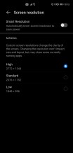
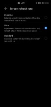
Resolution and refresh rate settings
If you like high refresh rate screens for the perception of smoothness they give out in normal use, you will have absolutely no problem with the Huawei Mate 40 Pro. If, on the other hand, you're into HRR because of HRR gaming, then obviously a 90 Hz screen will never be able to let you play at more than 90 Hz, so there's that to keep in mind.
Display quality
Now that we got all that out of the way, let's also mention that the display on the Mate 40 Pro is stunning. It may have a weird resolution and aspect ratio (in that neither is generally used in the mobile world), but the quality is exactly where it should be for a phone this premium. It's easy to view even on the sunniest of days outside, and it gets dim enough at night so that it doesn't sear your retinas when you want to read something in pitch darkness.
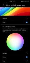
Color mode and temperature settings
As with all recent smartphones, you can adjust the color temperature to your liking, and we liked that there are just two options - Normal and Vivid. Simple. The first one gives you more accurate colors, the second pumps up the saturation if that's what you're after. We like Vivid, so we chose it, but went with the Warm color preset, because both Default and Cool have laughably blueish white points. If the presets somehow don't do the job for you, there's an entire color wheel to play with.
Display features
Auto brightness has been iffy on multiple occasions, a lot of times it doesn't want to react quickly enough to big changes in ambient lighting, so you're either stuck waiting for it to get the memo or manually fiddle with it. Other times, it would lower itself aggressively when there was no need to, we encountered this a lot when reading in a room that only had a dim LED light bulb on - but that bulb was very close to us, hence why the jumping to minimum brightness didn't actually make any sense. We are assuming these things are easily fixable through a future software update, and hope they will be, as they slightly take away from the general experience of using this phone, which has been otherwise outstanding.
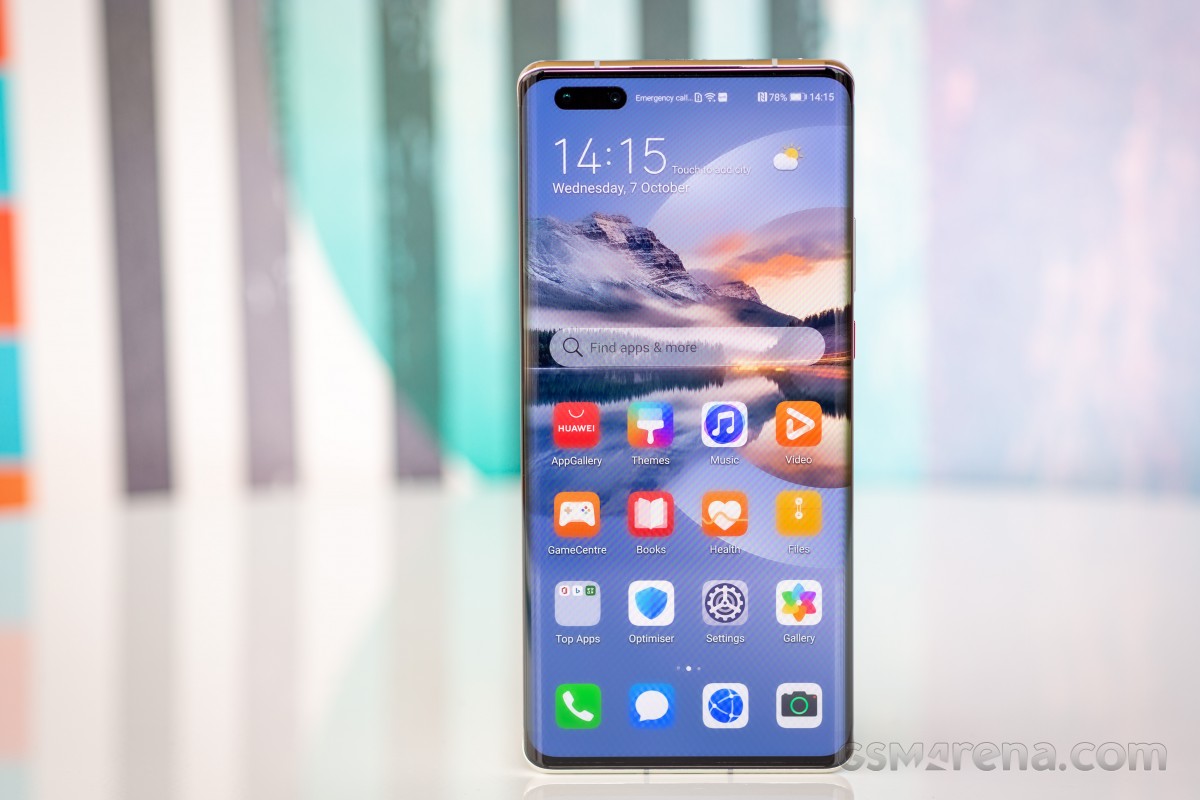
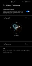
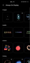
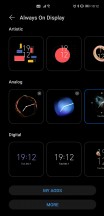
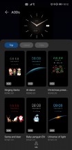
The Always On Display is, in EMUI 11, one of the most customizable implementations we've ever seen. There are analog clock designs, digital clock designs, as well as an "artistic" and a "graffitti" category, with many entries to pick from, many options to customize, and if none of the built-in styles work for you, then you can jump into Huawei's theme store to pick up new AODs (as well as themes, of course).
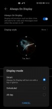
The AOD can be always on or scheduled, but EMUI 11 brings a new third option which is called "Smart". This turns on the AOD only when you tap the screen or when you're looking towards the phone, and while that may sound finicky it works incredibly well and from very varied angles. It doesn't work if you're across the room, or about more than 1m away from the phone with your body, but otherwise it was uncanny how well the phone 'knew' we were glancing at it, instantly popping up the AOD for us, only to then shut it off when we looked another way. We have to confess we played around with this for a while when we first received the Mate 40 Pro.
These smarts extend to a feature that's similar to Samsung's "Smart Stay", allowing the device to keep the screen on for as long as you're looking at it, regardless of what auto turn off setting you may have chosen.
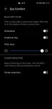
Eye Comfort is Huawei's name for its blue light filter, and all we can say about it is that it works exactly as intended. There's the usual intensity slider, scheduling is possible, and this is also where the DC dimming toggle lies - it's called Flicker reduction and will be a godsend for people who are sensitive to the flickering induced by PWM when the screen isn't very bright.
Biometrics
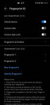
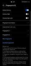
The Mate 40 Pro's in-display fingerprint sensor is one of the best we've ever used. It's very well placed exactly where your thumb comes onto the screen when you normally hold the device, it's incredibly fast and accurate and for all intents and purposes practically on par with the best of the capacitive sensors. Sure, there's still objectively a speed penalty compared to those, but it's so small that you won't be able to tell unless you use both types alternatively in day to day life.
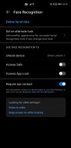
This phone has another trick up its sleeve, though. Its Face Unlock is of the 3D variety, which means it's the most secure Face Unlock you can get in the Android world. Since it doesn't just rely on the front camera for identification, it can also be used in the dark with no issues. It's fast, but not quite as fast as the fastest camera-only implementations out there, although that speed difference is definitely worth the added security you're getting here.
The Mate 40 Pro is 2020's most complete flagship from the perspective of secure unlocking options, giving you both a fast and accurate fingerprint sensor, as well as a 3D face unlock solution. You can obviously set up both and use whichever is most convenient. This is especially useful given the ongoing pandemic and mask use, when having just face unlock will make you enter your PIN or passphrase every time you're wearing a mask.
Performance, smoothness
The Kirin 9000 chipset in the Huawei Mate 40 Pro is a true monster and actually the first to launch of the new generation of 5nm SoCs that we'll see a lot more of in the Android world next year when phones arrive on the market with the Snapdragon 888 and Exynos 2100 inside.
As you'd expect from a top of the line chipset, this means the Kirin 9000 flies no matter what you throw at it. It's seriously impressive how we've seen zero lags, stutters, or hangs in our month with the Mate 40 Pro.
Not just that, but when it comes to smoothness, it's at least on par with the smoothest phones we've ever had for long-term reviews. But it also feels, subjectively as always, that it just about edges out and takes the crown. This is a phone that will never let you down when it comes to either performance or how
You might object to this section being this short, but there's really nothing else to say here - performance and smoothness are both as close to perfect as we've ever seen, so far at least. We're looking forward to another device taking away this crown from the Mate 40 Pro, but that hasn't happened yet.
Battery life, charging
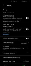
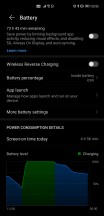
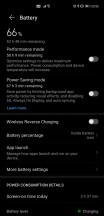
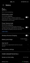
Battery life on the Mate 40 Pro has been incredibly good, day in and day out. We would call it "outstanding" or "the best we've ever seen compared to long-term reviews", but we can't do that because we just can't be sure. And that's because of the very annoying way in which EMUI 11 shows battery stats. The only screen on time number you get is calculated per calendar day, and not since the last full charge.
So based on this metric we could always dare to achieve more than 8 hours of screen on time in a day off the charger, and we're sure we could have also hit 9 or more hours easily. But we can't compare this further with the phones we've had for long-term reviews because it would sort of be like comparing apples to oranges. Still, you're unlikely to have any issues going through one full day of use with the Mate 40 Pro unless your use case is incredibly demanding.
Ours wasn't, at least not from a connectivity perspective. We spend around 12-17 hours with the phone off the charger, with mostly Wi-Fi connectivity, an hour or so of 5G, Bluetooth always on (with an hour or so of music streaming and an hour or two of calls), and location always on (with around half an hour of GPS navigation).
Charging takes about 45 minutes from zero to full on the bundled 66W adapter, and that's something to appreciate too. Only Xiaomi's Mi 10 Ultra and a few Oppo and OnePlus devices can do it faster. If you ever forgot to charge during the night, rest assured that you can quickly top up while you're getting ready in the morning and you'll still have enough juice to last you until you return home. Wireless charging with a Huawei accessory should be very fast too, but we didn't have one of those around to test. Still, wireless charging is very useful to have, and you can reverse wireless charge things as well.
Camera
We don't know why the Mate 40 Pro's main rear camera doesn't have optical image stabilization (OIS), but we are baffled by this decision, given how expensive the phone is and the fact that literally all of its similarly priced competitors do feature OIS on the main snapper. As you'll see from our samples below, the software is good enough to make ends meet even so, as the handset produces very good images in all lighting conditions. But maybe they would've been even better, especially in low light, had OIS been added?
That aside, as you'll see the Mate 40 Pro is a very good performer all-round. The camera app is intuitive and easy to use, and incredibly similar to what has been shipping on Huawei phones since EMUI 10. It also looks pretty much like every other camera app nowadays, as the various phone makers have seemingly all arrived at the same general design. We hope this has to do with the fact that this arrangement is the best for usability, and it's not just that it's the lazy route to go 'emulating' what everybody else is doing.
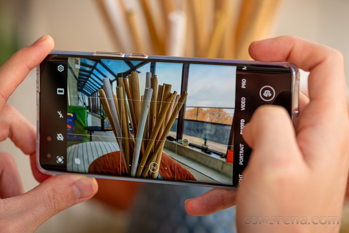
Throughout our time with the Mate 40 Pro, we had zero issues with the camera freezing or crashing on us, and starting it up is fast all the time.
Now let's see what it's capable of. Daylight shots come out of the main camera looking great, with extended dynamic range as well as rich and punchy colors. Textures are all there, as is a lot of fine detail. There's also very little noise. We shot these with Master AI turned off, but you can use that if you want specific things to get a saturation boost - we're talking skies and foliage, primarily. It can sometimes go overboard, though, which is why we left it off. We avoided shooting at the full 50 MP resolution of the sensor, as these pixel binning parts aren't supposed to be used like that and generally produce the best possible results when binned.


Daytime samples from the main camera
Huawei's ultrawides have recently acquired a reputation for being the least ultrawide out there, and this one is no exception, at 18mm. Quality-wise, however, it's exceptional. This is easily one of the best, if not the best ultrawide cameras on any smartphone ever. You get great levels of detail, almost no noise, and good sharpness throughout that tapers off slightly only towards the corners. Dynamic range is excellent too, while colors are vivid and ever so slightly different than the main cam's colors - this created a weird situation for us where we unexpectedly liked the ultrawide's look during the daytime more than the main snapper's.


Daytime samples from the ultrawide
The telephoto periscope is no slouch either, its pictures being detailed and practically noise-free too. Dynamic range is great, colors are punchy but warm, and overall it really seems like during the day you aren't necessarily giving anything up in terms of quality if you choose to use this snapper instead of the main one.
Onto low light samples now. For some phones, especially Xiaomi's, in our long-term reviews we have usually recommended the use of Night Mode as much as possible, because it seems to improve things (especially highlights) without any major downsides. Well, in the Mate 40 Pro's case, the situation is reversed.
The Auto mode is so good at night that there's almost no reason for you to ever use Night Mode. It feels weird writing this, but seriously - the normal Auto shots at night are incredibly good, with excellent dynamic range, well developed shadows, nicely (but not overly) saturated colors, and a decent handling of street lights. There are copious amounts of detail too, and while noise does sometimes creep in, in general you'll have a hard time noticing it at all.


Nighttime samples from the main camera, Auto mode
Compared to the Auto mode, Night Mode is somewhat disappointing. As all Night Modes, it takes more time to capture shots in this way, and its only redeeming feature is that you get a very minor improvement in highlights. That's it, though, and we don't think it's worth the time-to-shot tradeoff in 99% of cases.


Night Mode samples from the main camera
At night the ultrawide camera understandably isn't as good as during daytime, but it's still among the best ones out there, with brighter exposures than most competitors, decent shadow development, wide dynamic range, and pleasing colors. There is a quality penalty at night moving from the main camera to this one, but it's much less than in competing smartphones.


Nighttime samples from the ultrawide, Auto mode
Night mode shots on the ultrawide aren't very impressive, dropping fine detail and not doing much to improve other things either. While for the ultrawide the use of Night Mode may be desirable more than for the main camera, we'd still generally just go with the default Photo mode, its results are plenty good enough in most scenarios.


Night Mode samples from the ultrawide
The telephoto periscope does reasonably well at night, but you will need to have at least some light around for it to be able to work decently. If it does have enough of that, it will churn out sharp and detailed results, with very low noise, nice colors, and good dynamic range. The lower the ambient light levels, the more noise, unsurprisingly. When it gets very dark the phone will switch to cropping from the main sensor, however.
Selfies come with three zoom levels, let's call them close, wide, and ultrawide. The latter is best left for group selfies, and the choice between the former two is down to how much of your background you want visible, or put another way - how much of the frame you want your face to occupy. All of this could sound gimmicky, but actually the Mate 40 Pro's selfie camera is one of the most versatile around, giving you a lot of framing flexibility. The selfies themselves come out with pleasing colors, warm skin tones, great dynamic range, and excellent detail levels.
At night the quality goes down, understandably, and you'll have to hunt for a spot with at least some lighting around, in which case you can probably snap some usable shots, at least for social media and the likes. Obviously if you're going to capture selfies at night, you should remember to not do it in pitch darkness.
Conclusion
For this feature, we spent a little more than a month with the Mate 40 Pro as our one and only smartphone. That's more than the time we have for a normal review and less than we allocate for a long-term review. Still, over this time, a few things about this device have become obvious.
First off, if the Google apps and services situation wouldn't be the way it is, the Mate 40 Pro would undoubtedly be one of the easiest to recommend smartphones of the year. Don't get us wrong, it still is among the best of 2020, but buying one requires you to live without the comforts that Google's apps and services provide, and this will be a huge downside for a lot of people. Then again, those looking to escape Google's incessant tracking and targeting may feel right at home here, but we have a hunch that the number of the former is much higher than that of people in the latter group.
The Mate 40 Pro has pretty much everything going for it, aside from this and the fact that the main camera doesn't have optical image stabilization. We sometimes pick on much cheaper phones for omitting OIS, so we can't just give a handset that's this expensive a pass here. That said, Huawei's software camera magic mostly works around that hardware lack beautifully, but we can't help but wonder how much better photos would have turned out, especially at night, had there been OIS in tow for the main snapper.
Otherwise, this is definitely one of the Top 5 (if not Top 3) phones in terms of camera image quality. As usual, your exact preference has more to do with how much you personally enjoy each company's camera science. Still, objectively speaking, the Mate 40 Pro is up there with the best of the competition while beating it squarely when it comes to the ultrawide. Compared to some competitors such as Samsung's periscope-endowed offerings, the Mate 40 Pro also does better when it comes to zoom. So overall, you get a top-notch camera experience, hampered by the baffling lack of OIS on the primary sensor (maybe it has something to do with component availability following the most recent bans from the US Government?).
With the Mate 40 Pro, you also get one of the smoothest feeling phones this reviewer has ever used, easily on par with the smoothest we had for long-term review, if not slightly better. Performance is outstanding as well, as it should be given the new generation chipset, and perhaps it's unfair to compare the Kirin 9000 to the Snapdragon 865 and Exynos 990. A fairer comparison would be with the upcoming Snapdragon 888 and Exynos 2100. We'll have to wait and see how that pans out, but for now, performance is always on point, with no stutters, lags, or anything like that, no matter what you do. It's just that good.
Everything else about this phone is exactly as premium as it should be given its price point. The screen is fantastic, and the curves do not lead to accidental touches at all (but there is some glare on the sides when viewed head-on, an inescapable consequence of the curvature), and its lower refresh rate than some of its competitors is irrelevant for everything but gaming because in real life it feels as smooth, if not even more than those other phones out there touting 120 Hz.
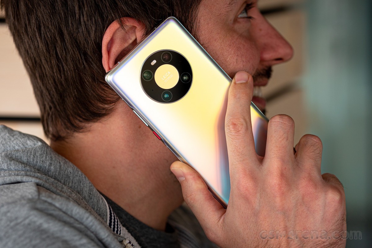
Battery life is incredibly good too, the design is striking, unique, and instantly recognizable, build quality is excellent. The feel in hand is very different from what you may be used to with glass phones; at least on our review unit it almost felt like it had a metal back. The myriad reflections and colors based on how light hits the rear is a neat added bonus without looking overly tacky.
In the end, what will make or break the Mate 40 Pro for most people is the software, and specifically your personal approach relating to software. Do you trust Huawei enough to keep updating this phone with useful features and security patches way into the future? Do you want to take part in the grand experiment it's been forced by political motives to engage in - creating its own mobile software from scratch to replace Google's? Can you live without Google's first-party apps and services and some third party ones that don't work? Are you content to find alternatives for those, or can you settle for the slightly inferior user experience brought about when going with mobile websites instead of apps? Do you care about voice assistants so little that you'd be okay with Alexa and Celia, while missing out on the Google Assistant?
And finally, two other questions not related to software. First - are you willing to live without OIS on the main camera on a phone that costs over €1,000? And second, about that price - is it worth it for you, given all of the above?
We can't answer any of these questions for you, but we hope this feature has given you enough information about the Mate 40 Pro and what it's like to live with for a month non stop so that you can decide for yourself what your very own answers will be.
All we can say is that we're sad it's come to this, and Huawei would have had one of the main flagship contenders of the year, sales-wise, in 2020, if politics would have stayed out of the mobile space. Alas, things are the way they are, and so we need to judge products based on what they are and not what they could have been. The Mate 40 Pro is an excellent smartphone with a few downsides. If you can live with those, including not knowing what exactly the future will bring in a year or two, software-wise, then it's definitely worthy of your attention and hard-earned cash.











































0 Response to "A month with the Huawei Mate 40 Pro"
Post a Comment